 |
|
So, ‘adaptive web design’ and ‘responsive web design’ are the latest buzzwords of social media industry. But many of us are still wondering what the real deal is about and what does it all mean? As more and more graphic designers are getting involved with crowdsourced design projects, understanding of such concepts is very crucial to avoid freelance design issues. |
The Story of Responsive Design |
 |
|
In May, 2010, Ethan Marcotte coined the term “responsive web design” by making it the title of an article in A List Apart. In that article he not only laid bare the problem facing most of the web designers and proposed very specific solution for it. |
|
It is that solution that is called Resposive Design and it includes three specific tools: |
| • Fluid Grids |
| • Flexible Images |
| • Media Queries |
|
Next came Marcotte’s book, Responsive Web Design, in which he explained the process and methods to practically apply this solution. Today Marcotte’s three-pronged approach has become the official meaning behind this term. |
|
The problem is that, initially, most of us take the word “responsive” for its standard meaning and assume that it is about varying display sizes or browsers, etc. Some of us think that the response of these web designs to the contextual variant depends on the interest of the designer. Some go so far as to think that it wouldn’t matter whether the site uses a flexible grid or shifted layouts on a fluid grid as the screen sets to other sizes. |
|
The real shock comes when a designer gets to know that only changing layouts is not enough until it happens through a fluid grid with flexible images. |
|
The site which responds to varying contexts without a fluid grid and flexible images is called “adaptive web design”. |
An Adaptive Response Story |
 |
|
An “adaptive web design” is not limited to fluid layouts. This is good because the web is full of millions of websites already working, and for the web developers managing them, it’s nothing less than a headache to start from the scratch to rebuild their output mark-up, CSS, etc. |
|
In such cases, adaptive design proves to be a more pragmatic solution: quicker and cheaper, comparatively. The best possible solution mostly is to leave the current design built for desktop displays and simply adapt it for varying contexts. |
|
Practically speaking, adaptive design and progressive enhancement are the same things, and they both aim to improve user experience for the widest possible audience. Aaron Gustafson also establishes the same conclusion in his book, Adaptive Web Design, which explains the philosophical approach to web design known as Progressive Enhancement. The book also includes practical application method of this approach in CSS, JavaScript, and HTML. |
|
All in all, what I have come to understand so far about this concept is that Adaptive Design is concerned more with the controlled adaptation or the less fluid approach of adapting existing web designs than the truly fluid and flexible responsive design. |
A Quick Look at Progressive Enhancement |
|
Simply put, Progressive Enhancement is to begin with the simplest form and working your way out. It starts with designing for the lowest common denominator and then progressively enhancing the experience for the fortunate designers who own a 27 inch iMac display and a version of webkit. |
Need Some More Explanation? |
|
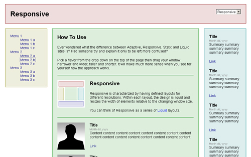
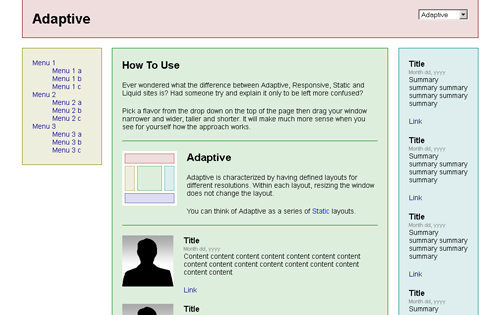
I understand that only reading about technical stuff is boring and rather difficult to comprehend sometimes. Therefore, I’m adding this wonderful weblink, created by Nick Davison, the director of web development for ad firm Digitaria. |
|
Here you will not only find easy definitions for Adaptive and Responsive web designs but also for Liquid design and the Static web design. Each page displays the functionality of the concept it explains and you would hardly find a simpler example to understand these rather complex ideas. |
Have Your Say! |
|
Have you used the Adaptive and Responsive web designs so far? If yes, which one did you like most and which of the two would you prefer for your own website? Let us know your thoughts in comments section below. |


adapt to screen, but not to browser. in IE 7-8 for ex is useless, there are other better example