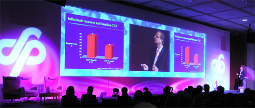
Exhibition graphics are hugely important both for exhibitors and organisers as they help to communicate important messages to the attendees. Graphics can be used at a wide range of corporate events, including parties and conferences. There are hundreds of reasons why big brands invest heavily in their exhibition stands and graphics – it’s something that your business should be considering too.
The activities you lay on for attendees at your conference or exhibition stand are obviously very important, but the graphics that you use are what will actually attract those attendees first and foremost. You might be laying on the best conference or exhibition ever – but if you don’t have great graphics displays and marketing in place in order to draw the crowds, no one will ever come to find out more about your business or brand at your corporate event.
Exhibition Graphics – Does a Design Really Matter?
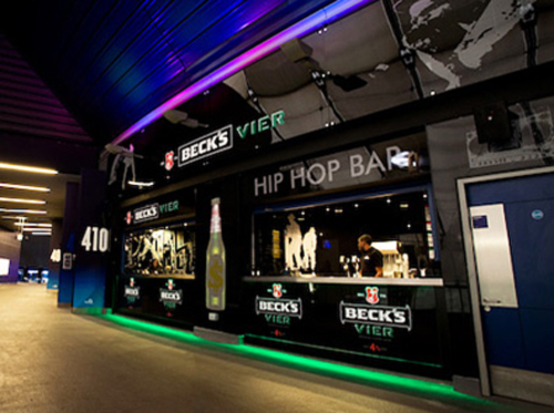
If you’re going to go to the trouble of having your graphics printed, it’s very important for you to ensure you’re happy with the graphics. There’s no point using them if they don’t enhance your brand’s image – or if they aren’t quite what you envisaged.
Here are three reasons why the design of your graphics really does matter:
- • The design represents your brand – a dull or badly researched design reflects badly on your business or brand as a whole. If you don’t have graphic design expertise in-house then you’re not alone – join the thousands of other businesses and brands out there who outsource their display graphics.
- • A design is an opportunity for you to grab the attention of people; your design should leave people interested to find out more about your business or brand. Keep people hungry for more – don’t bore them with an ill-planned graphic that just doesn’t look great.
- • Your graphics are an opportunity to set the tone. Bright, vibrant designs promote a fresh, inspired feel – whereas darker designs tend to come across a little more formal. You can dictate the mood of your conference and get people in the right frame of mind by effectively using carefully selected visual graphics.
Planning your Conference Set…
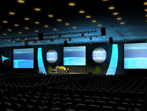
There are often media opportunities available at conferences – whether that’s for a national news outlet, or even just a magazine or journal specific to your industry. Plan your conference set and graphics ahead of time to ensure that your business’ branding is consistently displayed around the conference facility – it’s a great way to get a little extra exposure, just in case cameras do turn up!
If you’re familiar with the conference system, you’ll know that lots of people that attend usually visit various conferences with specific objectives in mind. If you’re serious about making your conference enjoyable and rewarding for those that take the time to visit, it’s important for you to stimulate all of their senses. Give attendees great graphics to marvel at, a great speech to listen to and tasty refreshments.
The art of executing a successful conference is by no means easy – it’ll certainly take a few rounds of trial and error before you can finally claim to have cracked it. The best place to start when planning for a conference or exhibition is with graphics – they’re the façade of your business, the first thing that people will see. Create a great impression by employing the use of amazing graphics and take things from there.

