istanbul evden eve nakliyat
X

Being a Female, What is your Clothing Style?

Weird Photoshop mistakes – 25 Super Bloopers!!
 

In this highly developed and advanced world of graphic design, softwares like Photoshop and Corel Draw are a blessing for graphic designers. Almost all forms of graphical material that is published, be it print ads, news clippings, photos, movie posters or magazine covers, are created using the magical techniques of Photoshop.

While Photoshop has the power to create wonderful advertisements and publications, a slight neglect on the part of graphic designer can lead to a Photoshop howler. The same Photoshop that has the potential to create wonders for a graphic designer can produce big blunders if not properly managed. Many Print ads, publications and movie posters go unchecked and produce a total catastrophe due to silly Photoshop mistakes.

Take a look at 25 of the weirdest Photoshop bloopers galore:


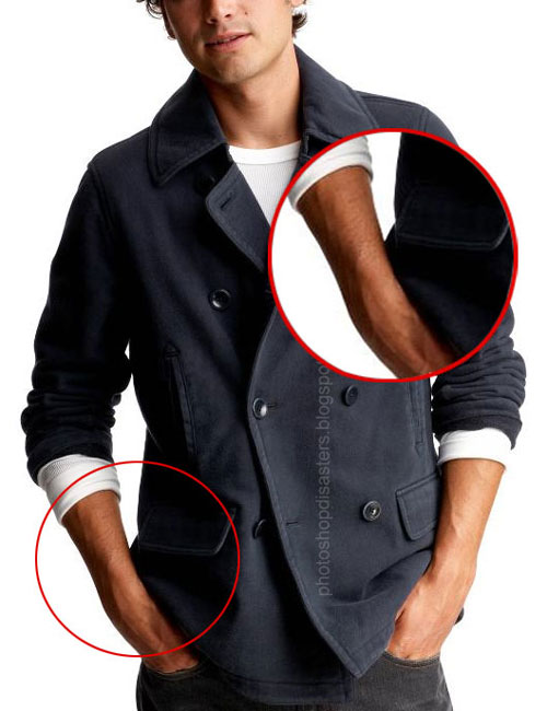
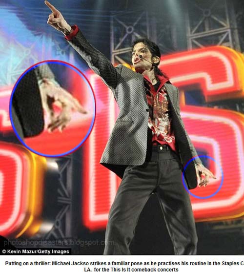
Photoshop Disaster 1:


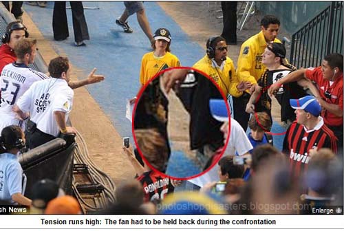
Photoshop Disaster 2:


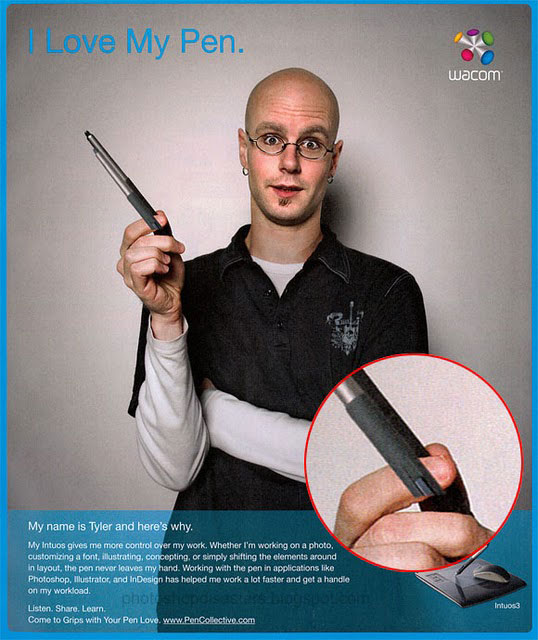
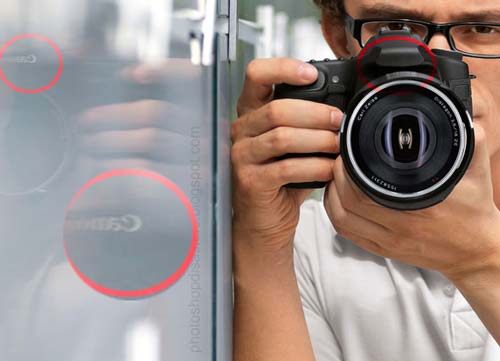
Photoshop Disaster 3:


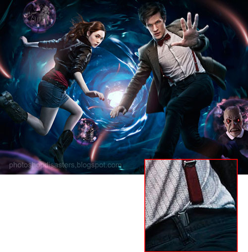
Photoshop Disaster 4:


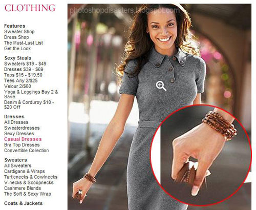
Photoshop Disaster 5:


Photoshop Disaster 6:


Photoshop Disaster 7:


Photoshop Disaster 8:


Photoshop Disaster 9:


Photoshop Disaster 10:


Photoshop Disaster 11:


Photoshop Disaster 12:


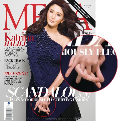
Photoshop Disaster 13:


Photoshop Disaster 14:


Photoshop Disaster 15:


Photoshop Disaster 16:


Photoshop Disaster 17:


Photoshop Disaster 18:


Photoshop Disaster 19:


Photoshop Disaster 20:


Photoshop Disaster 21:


Photoshop Disaster 22:


Photoshop Disaster 23:


Photoshop Disaster 24:


Photoshop Disaster 25:


So guys… which of these Photoshop Bloopers amused you the most? And Why?


  1. Jahangir On March 23rd, 2010 at 12:31 pm
    1

    LOL, very funny mistakes :D

  1. lukasz On March 23rd, 2010 at 9:58 pm
    2

    careful some of these aren’t actual mistakes and were intentional. most are definitely “oops”‘s though.

  1. Robbie On March 24th, 2010 at 11:44 am
    3

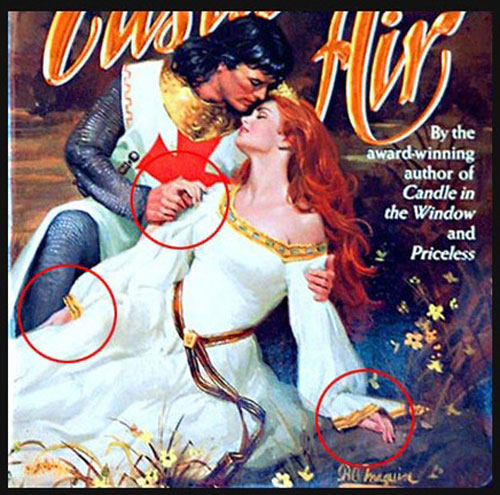
    I don’t see what the “mistake” is in #1, 2, 6, 7, and 8?? Can someone explain, please?

  1. iedge card On March 25th, 2010 at 1:17 am
    4

    I think these are funny mistakes. They happen, especially when the designer is paid a sub-par rate for their work. When I began as a designer I had the same feelings that Brian Jones has; which I maintain to the best of my ability. However, many in-house designers aren’t pair or respected in the sane way that a design firm is. So it’s not unbelievable that design treated as a commodity will have the same level of errors as anything else that is mass produced.

  1. Jorde Vorstenbosch On March 25th, 2010 at 4:37 am
    5

    Alot of these aren’t even mistakes, let alone disasters. For example #22, it’s the bike that’s this way, not a disaster.

    Never rode a mountain bike I reckon? Most saddles are laid back like that on mountain bikes, and it’s just his leg that’s in front of the bar that’s holding it.

    #1, #2, #6, #7 disaster? Where?

  1. Kaitlyn On March 25th, 2010 at 8:56 am
    6

    This is hysterical…I don’t get the “mistake” in #7 but I got the rest :P This kind of makes me feel a bit better about the mistakes that I make myself, I guess we’re all human afterall

  1. joe On March 25th, 2010 at 9:10 am
    7

    This has nothing to do with pay, but everything to do with inability. Most of these people have no business doing what they’re doing.

  1. Most Tweeted Articles by CSS Experts On March 25th, 2010 at 9:18 am
    8

    [...] Mini on the iPhone, including a feature overview and a real world speed te… 2 Tweets Weird Photoshop mistakes – 25 Super Bloopers!! | Graphic Design Blog - An Ultimate Resource for G…   In this highly developed and advanced world of graphic design, softwares like Photoshop and [...]

  1. dan On March 25th, 2010 at 9:30 am
    9

    I agree with Robbie;
    “I don’t see what the “mistake” is in #1, 2, 6, 7, and 8?? Can someone explain, please?”

  1. dan On March 25th, 2010 at 9:31 am
    10

    I agree with Robbie, I don’t see any mistakes in 1,2,6,7,8

  1. dan On March 25th, 2010 at 9:32 am
    11

    and i 13 she just has her armes crossed and tangeled … thats not a mistake

  1. Richard van Heukelum On March 25th, 2010 at 9:33 am
    12

    Numbers 1, 2, 7, 18 and 25 are fine, even though they seem odd.

  1. justshootme On March 25th, 2010 at 9:40 am
    13

    are you sure you don’t photoshop the bloopers yourself…? because some of them are just too frontal and stupid i cant believe it.

  1. carnie On March 25th, 2010 at 3:59 pm
    14

    robbie - if you can´t see them… you´re not not looking… open your eyes m8.

  1. r4 kaart On March 26th, 2010 at 2:07 am
    15

    “I don’t see what the “mistake” is in #1, 2, 6, 7, and 8?? Can someone explain, please?”

    well in 2 the guy has no body left
    in 6 the line is broken and 8 looks like the girl has 2 arms

  1. Dubico On March 26th, 2010 at 3:25 am
    16

    I agree with Robbie where’s the mistake in 1,6,7 & 8? (in 2 we see straight through the man hold back by the guy in red). An explaining text would be nice :)

  1. TordDesign On March 26th, 2010 at 10:36 am
    17

    Haha! Photoshop mistakes are always very funny ;-)

  1. matin On March 26th, 2010 at 10:44 am
    18

    number 11. I mean how could you not see that. It’s too obvious.
    Cool post!!

  1. Julia On March 26th, 2010 at 5:37 pm
    19

    Nice blog, thanks for putting it together. My favorites are the photos where crowds get duplicated. Propaganda loves photoshop. It makes politicians look more popular than they are.

  1. 509 Media On March 27th, 2010 at 12:03 am
    20

    LOL good times. I needed a good laugh after a long day. I know I have left out some things when photochopping. Good to see I am not the only one. haha.

  1. (Anti) Social-Lists 3/28/10 | (Anti) Social Development On March 28th, 2010 at 6:44 am
    21

    [...] Weird Photoshop Mistakes - Some of these images are funny and some are really creepy. [...]

  1. Charlie B. Johnson On March 29th, 2010 at 7:50 am
    22

    Thanks everyone for your comments…I see some of you could not notice the errors in some of the photos. Although I must say the mistakes are very minute but then again mistakes are mistakes…

    @Robbie…In #1,notice Michael’s left hand forefinger in missing while making a “groove” sign.

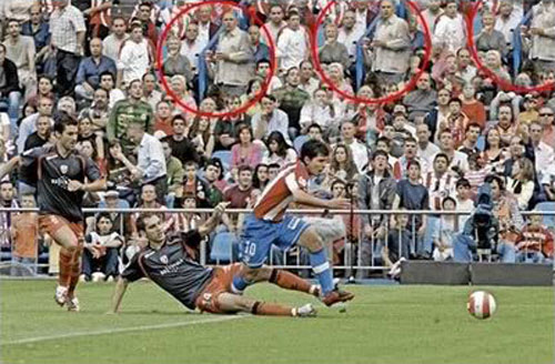
    In #2 we see straight through the fan in black shirt being held back.

    In #6 the rope behind Jackie’s leg is broken.

    In #7 notice Torres’s shoe is smudged out in the bottom, one can see the grass through the shoe.

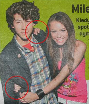
    #8…the girl on the left has three arms

  1. Charlie B. Johnson On March 29th, 2010 at 8:05 am
    23

    @Dan…In #13 observe the girl’s tangled fingers, they are unrealistically long.

    @Dan…In #13 observe the girl’s tangled fingers, they are unrealistically long.

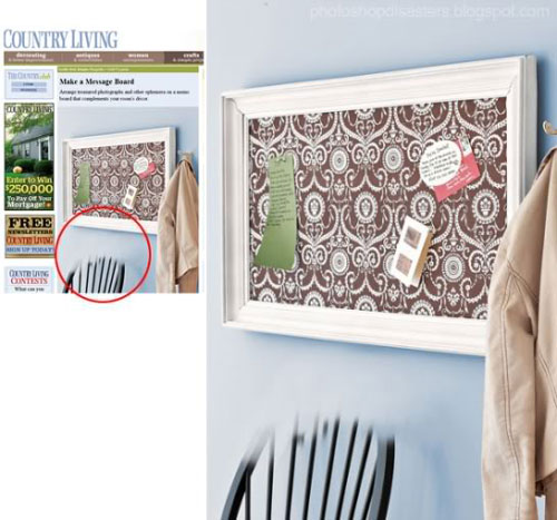
    @JORDE VORSTENBOSCH…This was one of the most obvious, the bike seat is missing.

    @R4 KAART @DUBICO…Thanks for pointing out the mistakes guys!

  1. DelightfulGoodness On March 29th, 2010 at 8:30 am
    24

    Hands seem to cause a lot of people a lot of trouble…some good ones in there. I hope I never see any of my stuff in one of these lists haha

  1. Chris On March 29th, 2010 at 5:54 pm
    25

    This is ridiculous! How can they NOT notice those mistakes??

  1. Rory On March 30th, 2010 at 3:17 am
    26

    Ha ha ha…these are great. Those ‘designers’ should be shot, what sloppy workmanship! Loving the warped fingers and legs, looks like there is more than one Stretch Armstrong.
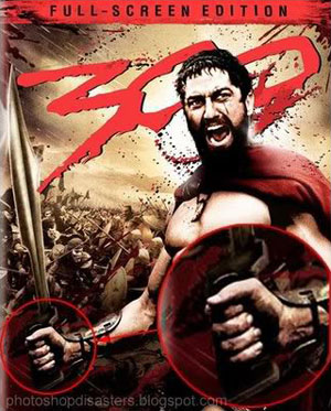
    Imagine a blockbuster movie like 300, which relies heavily on the cinematography and ‘look’ of the film only to have mass printed movie poster that is heavily flawed. I hope the designer was fired - mean I now!

  1. dd On March 30th, 2010 at 7:06 am
    27

    iedge card | March 25th, 2010 at 1:17 am

    I think these are funny mistakes. They happen, especially when the designer is paid a sub-par rate for their work. When I began as a designer I had the same feelings that Brian Jones has; which I maintain to the best of my ability. However, many in-house designers aren’t pair or respected in the sane way that a design firm is. So it’s not unbelievable that design treated as a commodity will have the same level of errors as anything else that is mass produced.

    Yeh its nothing to do with last minute changes quickly needing changing under pressure…

  1. Robbie On March 30th, 2010 at 11:09 am
    28

    Ok, thanks to all who tried to explain these disasters.
    However…
    1: 5 fingers on his left hand and it looks fine to me. Maybe it’s the blurriness?
    6: The line is broken? But isn’t the line going behind the left leg since it’s coming out behind Jackies right leg?
    8: The girl on the left has one arm around the other girl and one hand on the purse (the lower hand). The girl on the right has her right hand on the purse too (the top one). So I see no mistake there?

  1. Frankie88 On April 1st, 2010 at 4:43 pm
    29

    Some of these are an amazing hoot!

    To ROBBIE: #8 - it’s not a purse - it’s the girl on the left’s arm from a prior/later pose! Funny!

  1. 25 redigeringsmisstag i Photoshop | Fotograf Oliver Wettergren On April 2nd, 2010 at 3:01 am
    30

    [...] Graphicdesignblog.org har samlat ihop 25 redigeringsmissar som gjorts i Photoshop genom tiderna! Vissa missar klantigare än [...]

  1. Henrik On April 2nd, 2010 at 4:03 pm
    31

    Haha wonderful. I think it’s more common that you think that people try to fix mistakes after wards and at the same time they don’t want to hire an expensive professional to do it :D

  1. charlotte On April 3rd, 2010 at 4:49 am
    32

    here is a whole bunch of Photoshop tutorials and they have some great graphic design resources if anyone is interested. nice post

  1. Cathy Mason On April 3rd, 2010 at 1:02 pm
    33

    This was funny..and scary.
    Is anything real anymore?

  1. Alden On April 3rd, 2010 at 11:56 pm
    34

    1- Michael clearly has 5 fingers on both hands in the 1st photo…
    6- the rope goes behind both legs… how is that broken?
    8- looks weird, but Robbie is correct.

    crowd replication is funny

  1. Edwin Ortega Bu On April 5th, 2010 at 2:03 am
    35

    Interesting!! from mistakes we learn !!

  1. Henna On April 9th, 2010 at 1:14 am
    36

    they are all very funny mistakes i agree, but lets not judge them too harshly, after all they were humans who did them and no body is prone to mistakes, they make us think for a while that no matter how advance we become, we cannot overcome everything!!

  1. 20dollarlogo On April 10th, 2010 at 9:18 am
    37

    really these are disasters.. designers and editors should appoint someone to lookover it.. its a blunder i think..

  1. Shamima Sultana On April 11th, 2010 at 3:51 am
    38

    oho..this is really great mistakes…
    very funny

  1. memory stick On April 13th, 2010 at 2:30 am
    39

    While Photoshop has the power to create wonderful advertisements and publications, a slight neglect on the part of graphic designer can lead to a Photoshop howler,many in-house designers aren’t pair or respected in the sane way that a design firm is. So it’s not unbelievable that design treated as a commodity will have the same level of errors as anything else that is mass produced.

  1. SJL Web Design On April 14th, 2010 at 5:36 am
    40

    Haha, these are great!! I’m sure the designers have learned from their mistakes!

    Good post.

  1. Hans Maerker On April 15th, 2010 at 7:33 am
    41

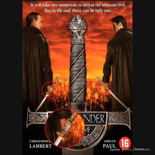
    Regarding #2: Guys, look at the hand (blown up circle)!. The caption of the picture says that the person is restraint. Yet, if you restrain somebody, you “grab” him in order to hold him back. However, this hand is a totally relaxed hand. The actually shown arm is one that rests on an object with the hand hanging open and relaxed!
    - hm

  1. Sue On April 15th, 2010 at 11:47 am
    42

    Re #6 (Jackie Chan)-the rope isn’t broken-it’s that the light is reflecting off his pant leg. If you zoom in the web page, you can see the wrinkle of his pants over the rope. (Firefox ver 3 zoom in = ctrl/command +). My favorite is the creepy looking hand in #11.

  1. Terry On April 15th, 2010 at 10:18 pm
    43

    Don’t see anything wrong with #1!? What about the island between his legs! Usually, on a stage, when someone is standing like he is you can see the BACKGROUND (that great big red thing) between his legs (unless he’s wearing a floor-length dress).

  1. Angel On April 17th, 2010 at 6:05 am
    44

    nyc…..
    its wonderful many people got mistake but they can’t see properly i think we should solve a little bit of tiny mistake

  1. Paulette On April 24th, 2010 at 11:26 am
    45

    Readers should check out the originals. Many of the mistakes shown here aren’t there. But thanks for the really good exercise in paying attention to what you do before releasing it.

  1. Adams On May 20th, 2010 at 3:35 am
    46

    This blog entry is a disaster.

    A lot of the examples weren’t even mistakes.

  1. Cryssy On May 21st, 2010 at 8:01 am
    47

    1: Looks to me like Michael Jackson has six fingers in that pic; like he is doing the devil horns, but then somehow he still has his index finger down.

    8: that could very well make sense. The bottom hand in the red circle could belong to the long-haired woman and the hand above it could be the short-haired woman’s.

    I can easily see the mistakes in the others, though some are not the worst I’ve seen..

  1. Becksi On May 25th, 2010 at 11:20 am
    48

    Has noone spotted the nothingness in between Jacko’s legs??
    That’s the real mistake
    x

  1. Heather On July 21st, 2010 at 9:07 am
    49

    I don’t think #2 is a photoshop blooper unless something is really evident if this can be seen larger.
    The man in the picture is being pulled back, I think it’s just him at a weird angle from being pulled… and since everyone is wearing black pants, it looks like we’re seeing through his black shirt.

  1. aje On July 22nd, 2010 at 8:02 am
    50

    number seven look at his foot it is definitely photoshopped. bu tnumber eight is the girls hand holding the bag!!! NAH-DUH!!!! my fave was probs the finger nail one…XD

  1. Gautham On August 10th, 2010 at 11:54 am
    51

    #1. This blog has failed for completely neglecting the HUGE island in the Michael Jackson cutout and concentrating instead on a seemingly normal hand.

    #6, #7, #8 are trainwrecks featuring people with strange body proportions, malleable limbs, and a giant+midget model combination.

  1. Jim On September 3rd, 2010 at 8:56 pm
    52

    Yep, these are good. I’m not technically a designer; but, I worked in a commercial print house where we printed everything from ad posters to billboards. Design fu-pas get much more noticeable then these. Some we fixed, some we didn’t. My favorites were the upside down images- always good for a laugh. Keep them coming designers.

  1. PS3 gamer On October 4th, 2010 at 6:26 am
    53

    :D haha number 4 is great :)

  1. paola lozano On December 1st, 2010 at 4:32 pm
    54

    jajajajajaj the evil tween made me laugh so hard

  1. Stellaa. On December 16th, 2010 at 7:16 am
    55

    In 2, they suddenly got black T-shirts, in stead of yellow!

    Whaha, the evil twinn!

  1. tobiestenfeu On February 12th, 2011 at 9:18 pm
    56

    Number 9 is fudging hilarious. xD Especially with the guy all squinty-eyed.

  1. Patty On June 11th, 2011 at 7:38 am
    57

    @Dan
    Are you blind?!
    In 13 her fingers are abnormal!
    How could you miss that?!

  1. Is High End Fashion Photo Retouching Ethical? | Powerweave Studio On May 15th, 2013 at 7:56 am
    58

    [...] a lighter vein, check out this site for some Photoshop [...]


Write for us
  • Top 10 Designers Projects Won
    AbsolutMudd
    217
    ACEdesign
    208
    finaldesign
    198
    neonlite
    192
    vector
    179
    x3mart
    158
    XtremeCreative2
    130
    Sergem
    124
    lakshmiks
    116
    jaggu
    99


Recent Post

Categories

Archives

  • Popular Posts

  •