istanbul evden eve nakliyat
X

Being a Female, What is your Clothing Style?


Many times you design a logo with utmost concentration, putting in all your creative instincts but unluckily final results don’t turn out to be exceptional. But with the growing logo awareness, the competition has become tough and our logo design needs to be perfect…no room for mistakes. I am sure almost every logo designer will relate to this situation….at least happened with me many times :( .


Now, when I think I have learnt from my mistakes being in the field of Graphic Design , I would like to list them here. This list will surely help you coming up with better results.

 
Don’t hesitate adding to this list from your experience….it is always great to learn from others.
 
  1. Don’t stick to logo design trends . Your logo should be timeless and appeal the eyes for lifetime.
  2. Should be designed for all mediums, compatible for all the available marketing and advertising mediums. 
  3. Avoid designing busy logo designs with multiple images. A simple concept is hard to forget.
  4. Roughly sketch your logo concept on a paper… Just don’t stick to the design softwares.
  5. Never make the final touches in hurry…take your time.
  6. If your logo fails to look good in black and white then it is useless adding colors to it.
  7. Nature of the industry should reflect in the logo design]
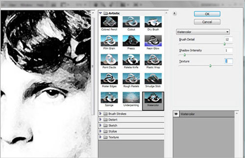
  8. Never make the mistake of designing a logo in Photoshop. Always use vector graphics software, such as Adobe Illustrator or Corel Draw. 
  9. Never use stock vector graphics in a logo, it is easily spotted.
  10. Only readable and clean fonts can make your logo speak to your clients
  11. Never think a colorful logo is always attractive and successful.
  12. Lastly, be inspired by other logo designs but strictly avoid copying them.
 
In the end I would like to add that most of the businesses fail because of poor marketing and we all know that a logo is the greatest marketing tool. So, my friends, if we all avoid doing these silly mistakes we can surely please our clients and be proud of our own creations.
 

  1. Justin Downey On December 4th, 2009 at 10:03 am
    1

    I was always taught that a logo should be simple enough to be embroidered or easily viewed at about the size of a quarter.

  1. Laurent JOUVIN On December 4th, 2009 at 2:57 pm
    2

    I know what you mean. Unfortunately, those mistakes are often times driven by the client’s requests and their lack of artistic knowledge. The hardest part is to build a relationship with new clients, and gain their trust and confidence.

  1. gift ideas On December 5th, 2009 at 1:31 am
    3

    Great post and review on logo designing mistakes.I would like to say this post is written by a true professional logo designer who charges big bucks for logo design…I have learn alot from here…
    Thanks.

  1. Febby Tan On December 6th, 2009 at 2:35 am
    4

    I agree with this one: “Never make the mistake of designing a logo in Photoshop. Always use vector graphics software, such as Adobe Illustrator or Corel Draw. ”

    The unlimited freedom in Photoshop often makes us over-decorate the logo. We’ll ended up making graphic arts instead of logo.

  1. STRAIGHTALK On December 6th, 2009 at 11:06 am
    5

    I love to read your articles they are very STRAIGHTALK and actually real content!

    Sorry for the mishap on twitter I will get You back on I always look forward to your writings & I sometimes learn from them.

    Thank You
    For being a great friend

    Norman Flecha
    http://www.straightalk.biz

  1. greaterlightmedia On December 6th, 2009 at 4:18 pm
    6

    in regards to bullet #9 Never use stock vector graphics in a logo, it is easily spotted…. what about using stock graphics and them tweaking, modifying or adding to them?

  1. Cam Sweeney On December 6th, 2009 at 5:03 pm
    7

    Nice, concise wrap up. Thanks for posting.

  1. John B On December 7th, 2009 at 12:06 am
    8

    Good tips, not so busy logo, relate to company, and make sure it looks good in black and white, got it.

  1. Kyle Gile On December 7th, 2009 at 6:54 am
    9

    Great article and some great tips!

    One quote that really stood out at me and I strongly agree with was “A simple concept is hard to forget.” That is extremely true. Unfortunately, many clients don’t see that, but I’ve noticed more and more clients are starting to realize that.

    Once again, great article!

  1. ropes On December 7th, 2009 at 7:53 am
    10

    Great tips. I think that the Logo should be simple and it reflects the Company Products.

  1. links for 2009-12-07 | AndySowards.com :: Professional Web Design, Development, Programming Freelancer, Hacks, Downloads, Math and being a Web 2.0 Hipster? On December 7th, 2009 at 8:03 pm
    11

    [...] 12 Silly Logo Designing Mistakes – Strictly avoid!! | Graphic Design Blog - An Ultimate reso… If you avoid these 12 silly tips you will surely come up with a perfect logo design. [...]

  1. Mondo Print On December 8th, 2009 at 1:34 pm
    12

    Great tips! Thanks for sharing.

  1. Yanne On December 8th, 2009 at 2:47 pm
    13

    Nice post :)
    That black and white tip was useful. I also agree about sketching on paper first, because it effectively eliminates the chance to use any stock-content in the design and the logo becomes more original. When you first sketch a simple design on paper, you can then easily turn it into a vector graphics image on computer.

  1. maria On December 8th, 2009 at 11:26 pm
    14

    Great article! its a great help! giving me good idea!

  1. Katie On December 9th, 2009 at 4:10 am
    15

    There is nothing more important than starting a brand in the right light, it is the grounding for the start of a business and ongoing design. It is becoming more and more evident that design sells.

  1. izdelava strani On December 9th, 2009 at 10:02 am
    16

    Very usefull tips, bookmarked!

  1. Jeromy On December 9th, 2009 at 10:18 am
    17

    Good suggestions, though I am always slow to make universal rules as some design opportunities may require a different solution in using one of the above “dont’s”.

  1. Joni On December 9th, 2009 at 8:07 pm
    18

    I can’t agree more. Now we just need to get our clients to read and EMBRACE these lessons. Whenever I lose out on a logo, it’s always to someone who will overuse gradients and give it “that Web 2.0″ look the client is looking for!!!

  1. Manz On December 11th, 2009 at 4:18 pm
    19

    How did you manage to access my brain and thoughts? ;)

    One other thing I make sure of is that the mark/symbol/words has a reverse option for use as white on black, for example. If you need to re-work elements for this application, then do so and address this at the same time your doing colour versions, etc.

  1. Rick Ramirez On December 12th, 2009 at 1:15 am
    20

    VERY VERY VERY IMPORTANT:

    “Never make the mistake of designing a logo in Photoshop. Always use vector graphics software, such as Adobe Illustrator or Corel Draw.”

    This is a MUST!!! Nicely put. Never use PS.

  1. VividColorWill On December 14th, 2009 at 2:35 am
    21

    Vector format is a MUST for printability and scalability. Also, simple colors/shades that can be recreated in black/white is helpful. Make sure your logo can appear on a variety of backgrounds, because you’re going to need it for different artistic situations. Thanks for the post.

  1. Lalo On December 15th, 2009 at 5:23 pm
    22

    You said: “Nature of the industry should reflect in the logo design”

    I think that’s by far the most important thing to keep in mind when designing (at least, for professional designers). I work in the videogame industry and very few times I’ve been requested to do print friendly logos. In fact, if you see all the logos used in videogames they tend to be very fancy and intrincate.

    I’m also not too sure what you mean by making a logo “timeless”, I don’t think the lifespan of a logo could be defined by the designer.

    Great list, and very useful for studens and beginners. :)

  1. elisa On December 16th, 2009 at 7:11 pm
    23

    good post! it is hard to follow this when clients want to break all these rules.

  1. Shamima Sultana On December 19th, 2009 at 11:38 pm
    24

    Its really helpful ..thanks

  1. Advertising Agency Melbourne On December 22nd, 2009 at 5:22 am
    25

    Simple but great. Neat post.

  1. thiet ke logo On December 25th, 2009 at 3:33 am
    26

    Sure, agree for all! Thanks

  1. 509 Media On December 30th, 2009 at 3:26 pm
    27

    I would also recommend not to over define your company with an image / design in the logo. Over the years companies adapt to changes in the market place, technology, and a growing product line. I would suggest designing the logo to have a large enough foot print to grow with rather than limiting your growth. Hope that makes sense.

    Dan

  1. 1415ME On January 3rd, 2010 at 6:43 pm
    28

    JUST AsJOUVIN rightly said “those mistakes are often times driven by the client’s requests and their lack of artistic knowledge” these is actully due to conciousness that the client may just be blinded to a choice of his. also we seek to respect their opinion mostly.

  1. Logo Design Services On January 4th, 2010 at 5:49 am
    29

    Yes I agree with you, Designer should visit the other logos to get inspired but NEVER NEVER to copy this. Thanks for sharing this.

  1. Trevor On January 26th, 2010 at 1:50 pm
    30

    I agree completely and thanks for the never design a logo in Photoshop point. I have lost count of the the number of times I have told other so called designers that and they just do not understand.

  1. graphicbeacon On February 2nd, 2010 at 7:43 pm
    31

    “If your logo fails to look good in black and white then it is useless adding colors to it”

    This point stood out to me the most. It helps to ensure safety precautions are set. The fact that it doesnt look good in black and white shows that you need to develop it further anyway.

  1. Brian - Logo Design On February 24th, 2010 at 1:09 am
    32

    It is possible to create a custom made logo design in photoshop with excellent effect and unique concept designs

  1. web designing chennai On July 27th, 2010 at 3:38 am
    33

    its really very useful and helpful tips, thanks for post.

  1. Tax Levy On August 6th, 2011 at 4:13 am
    34

    After reading these 12 mistakes when designing a logo, I just realized that I’ve made a half of them when designing my logo. I really learn a lot from these tips.


Write for us
  • Top 10 Designers Projects Won
    AbsolutMudd
    217
    ACEdesign
    208
    finaldesign
    198
    neonlite
    192
    vector
    179
    x3mart
    158
    XtremeCreative2
    130
    Sergem
    124
    lakshmiks
    116
    jaggu
    99


Recent Post

Categories

Archives

  • Popular Posts

  •