


 |
|
|
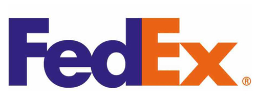
Minimalist logo designs are preferred more by graphic designers because of their ease and simplicity. But the difficulty in designing simple logos is to incorporate an effective message within the design. This can be achieved either through the technique of negative spacing or by interweaving the symbol within the typography. But sometimes…too simple becomes too complicated. Some of the greatest brand identities have logos with hidden messages. For example, the FedEx logo, designed by the famous logo designer Lindon Leader, appears to be a simple and straightforward. But on close examination, you will notice that there is an “arrow” between the “E” and “x” that signify the company’s aspirations for progress. |
|
 |
|
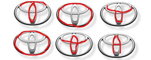
| Similar is case with the Toyota logo. Many of you might not know that the letters T, O, Y, O, T, A are found within the TOYOTA emblem. | |
 |
|
| Following is a collection of 24 intriguing logos that look simple but contain a complex message. See if you can find what hidden the messages are in these logos. | |
1. Logo concept |
|
 |
|
2. Lantex Transfer |
|
3. Kolner Zoo |
|
 |
|
4. Interduo |
|
5. HIDE |
|
6. Hidden Cork |
|
7. Helping Hands For Pets |
|
8. Games for Children |
|
 |
|
9. Fiska |
|
 |
|
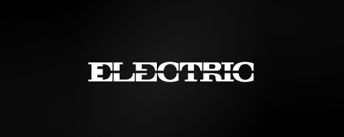
10. ELECTRIC |
|
 |
|
11. Effective sports |
|
12. Countercurrent |
|
 |
|
13. Child of the king |
|
14. Bullet |
|
 |
|
15. Blanco’s Construction |
|
 |
|
16. A_MAZE_ING |
|
17. Zoorganic |
|
18. Screw |
|
|
|
|
19. PIE (Pi) |
|
|
|
|
20. Pengu Constructions |
|
|
|
|
21. ONE UP |
|
|
|
|
22. NO ONE |
|
23. Neolica |
|
|
|
|
24. Negavite Way |
|
|
|
|
|
|


24 intriguing logos – When simple becomes complex!…
Thank you for submitting this cool story - Trackback from DesignSmash…