istanbul evden eve nakliyat
X

Being a Female, What is your Clothing Style?

Have you ever noticed that all the logos for major fast food chains are in red, yellow or both colors? Yeah, I tried to figure out if there is any hidden symbolism or fast food psychology and discovered it had something to do with the psychology of colors and graphic design more than anything did.

In graphic design color classes, they define that yellow is supposed to be associated with quickness and speed while red is supposed to stimulate appetite. Color has direct physiological effects on the brain. Red increases pulse, blood pressure, and respiration while yellow is the easiest colors that can be seen from the longest distance.

So, what are we waiting for, let’s see how many fast food restaurants have their logos in the strong, attention getting contrast of red and yellow or any of the two colors.

Pizza Hut - Pull The fun out of your pizza:

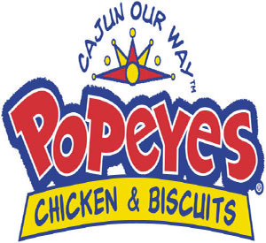
Popeye’s Restaurant - Love that chicken from Popeyes:
Popeyes-Restaurant-Logo

Burger King - Have it your way:

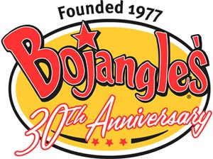
Bojangles - Flavor without fire:
Bojangles-Restaurant-Logo

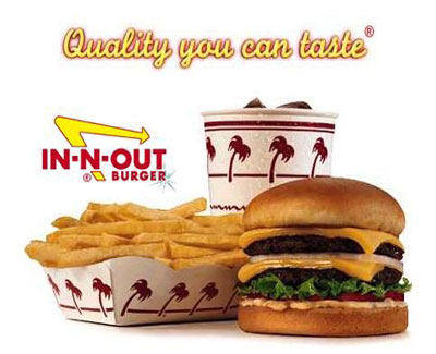
In-n-Out - Quality you can taste:
In-and-Out-Restaurant

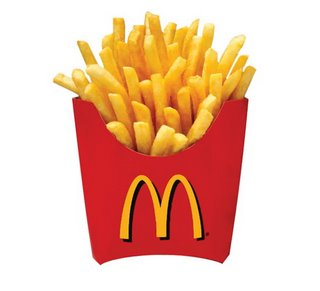
Mc Donalds - I’m Lovin It:
Mc-Donald-Logo

Wendy’s - Old Fashioned Hamburgers:
Wendy's-Logo

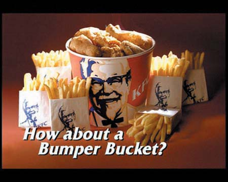
KFC - Finger lickin good:
KFC-Logo

Sonic - America’s Drive In:

Burger Chef - It’s All here:

However, many people still don’t agree to this theory of merging bright red and yellow for restaurants because they think these colors are not pleasant and relaxing, so those who choose to sit down to eat won’t stay long. What do you say…Does these colors really affect your appetite and tempt you to eat more?

Do write in to prove your point and let me know if I missed any of the restaurant logo in red and yellow.

  1. David Airey On August 18th, 2008 at 9:47 am
    1

    Don’t forget about Bobby’s Burger Palace logo, linked to through my name.

  1. Berger On August 18th, 2008 at 1:24 pm
    2

    don’t forget fuddruckers…i’m sure there are others…
    http://www.bitetv.ca/blog/archives/Fuddruckers-logo.jpg

  1. David On August 18th, 2008 at 5:33 pm
    3

    Warm colors — red, orange, yellow — are said to stimulate appetite, while cool colors tend to suppress it. That’s a major reason why restaurants often go with them.

    Warm colors also tend to excite or agitate (why it’s recommended that baby rooms are not painted yellow). But for a restaurant that’s looking to turn tables and get people in and out, that effect can be helpful.

  1. Christian On August 19th, 2008 at 3:38 pm
    4

    in Mexico, fast food restaurants have uncomfortable chairs so you eat fast and get a pain in the back so you dont stay for so long…

  1. Sam On February 9th, 2009 at 2:02 pm
    5

    You forogt Sonic.

  1. mom On February 10th, 2009 at 5:42 pm
    6

    rememer to eat your red and yellow vegies too my dears.

  1. Michael On May 7th, 2009 at 5:43 pm
    7

    don’t forget the biohazard logo.

  1. Fran On July 13th, 2009 at 9:01 pm
    8

    Why stop with fastfood, how about something more upscale like steak houses:
    Outback - Red and yellow
    Long Horn - Red, and yellow
    Black Angus - Red, black, and white
    Lone Star - Red, black, and gray
    Morton’s - goldish yellow, black, and white

    They seem to have the formula too.

  1. Restaurant Consultant On October 6th, 2009 at 10:36 pm
    9

    Psychology of colors in fast food is all about being catchy and an eye grabber. We haven’t tested it for subliminal appetite builder.

  1. Colors of eCommerce « Infinite User: a human factors and technology weblog On October 21st, 2009 at 11:43 pm
    10

    [...] Remember the first time you noticed that the biggest fast food chain restaurants all had red and yellow in their logos? If you’re at all like me (which you probably aren’t..) the excitement of this discovery was [...]

  1. Eunice On March 18th, 2010 at 2:32 pm
    11

    what about ihop? i know that’s not really a fast food restaurant, but it’s red and yellow…

  1. tri-fold brochure design service On March 24th, 2010 at 6:32 am
    12

    Good compilation. More i like the Pizza Hut logo. Thanks….

  1. Dwight On April 11th, 2010 at 12:32 pm
    13

    IHOP logo colors are NOT Red and yellow as mentioned by Eunice above. Their corporate colors are Blue and Red - not a hint of yellow! And, yes they are not a “fast food” restaurant, but rather “sit down casual”.

  1. Lerrah On May 12th, 2010 at 9:38 am
    14

    And of course the Hardee’s logo!
    http://www.hardees.com

  1. Shamima Sultana On July 1st, 2010 at 2:03 am
    15

    i love to eat Pizza hut’s special..yum yum yum…

  1. StudentA On April 13th, 2011 at 4:57 pm
    16

    studies prove that red affects the brain to stimulate us and make us hungry. it is actually quite smart on the restaurants part…

  1. The Lower Modernisms – 010. Matchbook Delight! Part 3, May Co. Department Stores. On September 29th, 2011 at 12:07 am
    17

    [...] color scheme of the matchbook is a lot like the mustard-and-ketchup colorway eventually adopted by nearly every fast-food chain, colors we allegedly associate with hunger and [...]

  1. The Visual Communication Guy On May 31st, 2013 at 11:04 am
    18

    I love the ketchup and mustard theory! With the exception of Subway and Olive Garden, it seems like just about every major restaurant follows this pattern. The amazing thing is, we consumers don’t even really seem to notice. I have my own theory about colors and our reactions to Walmart and Target.


Write for us
  • Top 10 Designers Projects Won
    AbsolutMudd
    217
    ACEdesign
    208
    finaldesign
    198
    neonlite
    192
    vector
    179
    x3mart
    158
    XtremeCreative2
    130
    Sergem
    124
    lakshmiks
    116
    jaggu
    99


Recent Post

Categories

Archives

  • Popular Posts

  •