istanbul evden eve nakliyat
X

Being a Female, What is your Clothing Style?


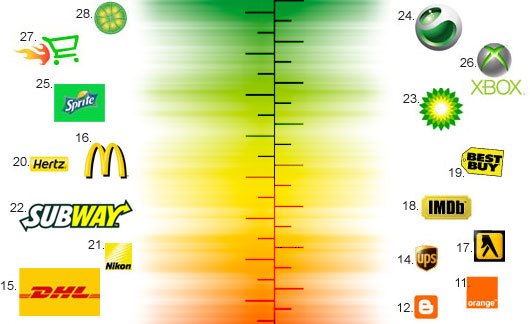
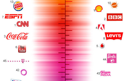
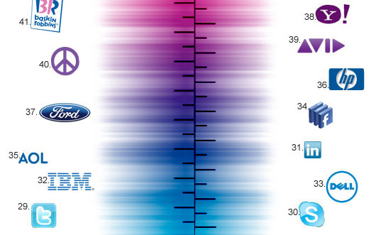
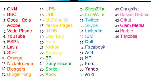
Behind every memorable brand, there is an unforgettable logo design. The foundation of a logo design revolves around three essential pillars …font, color and symbol. Out of these elements, color is the nucleus of a logo that dictates the charisma. This is because color contribution in logo design is critical in affecting your customers.

Some colors are friendly, while some have the properties of arousing anger. Some can make you hungry while others can do the exact opposite. Ever wondered why certain logos of the same industry adopt almost the same color scheme? For instance, major fast-food and beverage companies employ yellow and red colors in their logo. Likewise, Social Media sites like Twitter and Facebook use the blue tones because of its welcoming and sociable characteristic.

As a graphic designer, I decided to create a color spectrum that illustrates famous brands and their color scheme. Enjoy the Color Bar below and try locating your favorite brand J


  1. The Color Spectrum of Logos | The Buzz on Advertising, Marketing & Graphic Design On June 24th, 2011 at 8:21 am
    1

    [...] SOURCE This entry was posted on Friday, June 24th, 2011 at 9:19 amand is filed under Advertising. You can follow any responses to this entry through the RSS 2.0 feed. You can leave a response, or trackback from your own site. [...]

  1. Michael On June 24th, 2011 at 11:02 am
    2

    I like so much the logos in blue, very clean and professional!

  1. Adam Booth On June 28th, 2011 at 2:55 am
    3

    Colour theory is an integral part of any design whether it is for print or web based. This is never more true than in logo design. As you said, colours evoke certain emotions in us and make us feel a certain way which is a major part of design and the visualization of a brand ethos and personality. This is why brands can become so popular with out necessarily offering us anything different from less popular brands.

  1. Musa On June 28th, 2011 at 8:44 am
    4

    Wonderful Design.. Thank you very much for that sharing. i love DELL ;)

  1. Jenn S. On June 28th, 2011 at 2:51 pm
    5

    This is a beautiful info-graphic - I wish I’d thought of it first.

  1. Aanioz On June 28th, 2011 at 6:25 pm
    6

    Ever wonder. . . All the Social media giants are in Blue. . . :-)

  1. Dave On June 29th, 2011 at 2:46 pm
    7

    It’s a nice idea! And it’s comforting for some to think that there might be “rules” to design which would provide a short cut to getting it right. But in reality, for every red Coca-Cola there’s a green Sprite. For every green BP, there’s a bright red and blue Exxon. In fact, all this colour bar really does is select a few logos which fit the theory while excluding the vast majority which don’t. Sorry.

  1. Bush_Tag On July 1st, 2011 at 2:02 am
    8

    Wow. This is so wonderful and amazing :D I loved all the logos from pink downwards :D

  1. Will On July 4th, 2011 at 6:31 am
    9

    It’s a nice graphic, personally I go for the cheeky purples!

  1. Quora On July 6th, 2011 at 3:11 am
    10

    Why is blue such a popular color for many popular online social products?…

    You are absolutely right…Blue color is dominantly used in all the logos of social media platforms. I don’t think this trend has started because of “Facebook” logo, its just that “Blue” seems to be a user friendly color. Lately, I stumbled across…

  1. Designer On July 9th, 2011 at 4:21 am
    11

    Like your colour chart. It’s a good graphic to place known companies and their brand/logo colour.

  1. Candice On July 20th, 2011 at 8:42 pm
    12

    I love this! Most of my logos are blue, purple, or pink!

  1. Approved Web Design On August 19th, 2011 at 8:48 am
    13

    Excellent post, its such an important facet for any business. Making sure you have a well considered and designed logo is a great way to help establish your company.

    I believe a large proportion of companies under-estimate this part of their business branding.

  1. “What’s your favourite colour?” | Brand Regard - Magazine On September 16th, 2011 at 4:40 am
    14

    [...] Graphic Design Blog’s “Colour Bar” (which includes a very nice brand colour spectrum) states that colour dictates a brand’s charisma, and is key in affecting consumers. [...]

  1. LJ On November 14th, 2011 at 12:52 pm
    15

    Of course the key is to now reproduce that color the same in all modes. We have a hard time getting customers to understanding that the file the printer needs is sometimes different from what the copy shop needs and definately different from what their home printer needs, etc…..

  1. Joshua Parkhurst On January 30th, 2012 at 9:37 pm
    16

    Very cool chart! It’s cool to see how most food related logos stay close to the warm colors yet one or two start to venture away. Awesome! Transforms you thinking a bit.


Write for us
  • Top 10 Designers Projects Won
    AbsolutMudd
    217
    ACEdesign
    208
    finaldesign
    198
    neonlite
    192
    vector
    179
    x3mart
    158
    XtremeCreative2
    130
    Sergem
    124
    lakshmiks
    116
    jaggu
    99


Recent Post

Categories

Archives

  • Popular Posts

  •