istanbul evden eve nakliyat
X

Being a Female, What is your Clothing Style?

As graphic designers, we all love logo designs and the creativity embedded within them. One of the famous logos, also featured in my hidden logos post, was the BIG TEN Conference logo. It incorporated a cleverly hidden “11” between the words “BIG TEN”. Sports fans must be well aware of this organization. But for those who don’t know, Big Ten Conference is the United States’ oldest Division I college athletic conference. A few weeks back, with an addition of one more team, the firm decided to redesign their logo.
 

• The History of BIG TEN Logo – From 10 to 12:

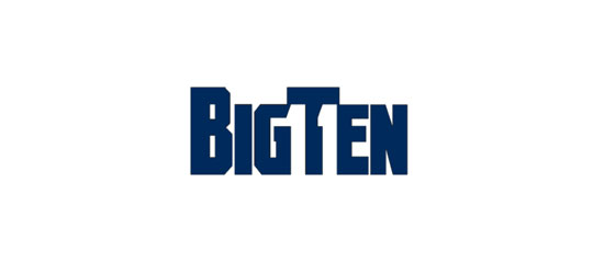
Previously, the logo for the institution cleverly concealed the numeral ‘11’ by using negative space. The figure denoted the eleven teams that play in the division. But this year in June, there will be one more addition to the playing teams in 2011 namely University of Nebraska-Lincoln. Since this would have made the old logo invalid, they decided to redesign it with a more appropriate one.
 

• The”BIG” idea behind the Redesign:

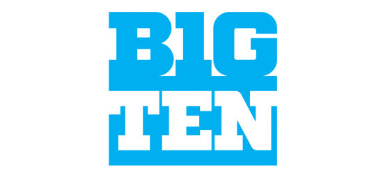
Pentagram’s Michael Gericke and Michael Bierut are the architects behind BIG TEN logo redesign. The new logo simply reloads the numerical ‘10’ in the term ‘BIG’, using the letters ‘I’ as 1 and ‘G’ as 0.  The idea behind the redesign is:
  • • For people to easily read the term BIG TEN in a single word.
  • • With every adding team, they won’t have to redesign the logo everytime.

BIG TEN logo redesign has received a fairly mixed response from the general public. Some like the idea of consistency that ‘10’ gives to the logo, while a few didn’t approve of it. As I mentioned in my earlier post, this is the era of democratic media where public opinions have become a major driving force in any brands lifecycle.


• BIG TEN Unofficial Redesign Contest:

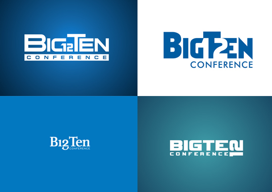
While there has been a mixed response on the redesign, Mycroburst.com has started an unofficial logo redesign contest of the BIG TEN conference, just for the fun of it. Please be advised that this contest is NOT sponsored by Big Ten. Below are a few of the drafts submitted on the contest:

• BIG Ten Logo Contest Details on Mycroburst:

Within days of its start, the contest has already attracted hundreds of designers. Over 609 drafts have already been submitted in pursuit of the $500 Guaranteed prize money. There are still 14 days remaining as the contest ends on 24th January 2010. Participating in this contest will bring a host of opportunities for graphic designers and an exposure of your design skills to the world. So go ahead and have fun.
 

Update:

Out of the many design entries received, 5 deserving logos have been scruitnized for a final voting. So come along and choose your winner…cast in your votes.
 

  1. Hollyn On January 11th, 2011 at 1:22 pm
    1

    I went to a Big Ten school for my undergrad, and I always thought it was misleading that the Big Ten conference had more than 10 teams…On the other hand, I like the logo on the bottom right. Turning the “12″ sideways to make the “N” was a good idea!

  1. Rachael On January 12th, 2011 at 1:49 pm
    2

    I liked the way the 11 was hidden in Big Ten using negative space in the original logo. I agree with the comment above about the name being misleading now there’s more than 10 teams and I also like the logo design with sideways N.

  1. Taulant On January 12th, 2011 at 7:18 pm
    3

    I don’t like them, nor the name! wack

  1. Andrew On January 12th, 2011 at 11:10 pm
    4

    I liked the 12 sideways as a choice very interesting choice

  1. Magento Themes On January 17th, 2011 at 5:16 am
    5

    Excellent name and logo. Indulging the 12 is great work.

  1. Yury Rush On January 18th, 2011 at 2:33 pm
    6

    I think a logo has to be memorable no matter if it’s obscured/hidden or whatever the artist does with it. Look at luxury brands as a standard - they are usually clean and simple; thus they are memorable.

    I like some of the drafts shown above, as long as they are not misleading as Hollyn above pointed out.

    Looks good!

  1. Josh On January 21st, 2011 at 9:44 pm
    7

    pentagram’s big ten is great.

    addressing the four drafts underneath:

    the first would probably be the best choice, although generic, its the cleanest and least awkward. The ideas for hiding the numbers in the logo are clever, but leave the logo disjointed. I love the concepts, they just don’t work for a final logo.
    Great work though.

  1. Bill On January 25th, 2011 at 2:39 pm
    8

    I think most have over-looked the Roman numeral idea. Here’s what I came up with. Using an “X” would satisfy the ‘Big Ten’, while several options could display the two “I” characters.for “XII”.

    flbill.blogspot.com

  1. Craig Fraser On February 6th, 2011 at 1:02 am
    9

    Logo contests are an insult to the profession. $500 is pathetic for a professionally design logo - even without a contest.

  1. jspiker On May 17th, 2011 at 2:38 pm
    10

    While there are clever ways to incorporate the numeral 12 into the design it is unnecessary and somewhat impractical due to possible ongoing expansion. The name of the conference is Big Ten. There is, in fact, a Big Twelve. That problem becomes even greater with the use of Roman numerals as the Big Twelve logo uses the Roman numeral “XII.” Incorporating a twelve might run the risk of trademark infringement and, at the ,east, confuse the viewer. Further, I see nothing misleading in not incorporating “12.” The number of teams really isn’t that important, Big Ten is a well-established brand. Keeping the name is no more misleading than, say, Joe selling his chain of diners to a corporation and them keeping the name “Joe’s Diner” on them. But, if you really have the misleading problem, the conference should change it’s name altogether (as should the Pac-10). And, as previously mentioned, “Big Twelve” isn’t available. Maybe just the Big Conference. All that aside, I don’t particularly care for the new logo. I find it rather boring and the 10 doesn’t readily reveal itself even when “BIG” is done in blue and black. I will say this for the logo, it feels like the Big Ten brand.

    As for Fraser’s comment, this is not a contest for a company seeking a logo. It is, as it says, for fun. Yes, $500 is an insult were the Big Ten holding a contest to get a new logo at slave wages. But this is not for commercial use. The Big Ten will not be using it and the logos will be of no use to anyone else as the conference name is trademarked. Should the people running the contest try to turn around and sell one of the logos to the conference, then, that would be another story.

  1. Dekker On July 11th, 2011 at 4:02 am
    11

    Pentagram seems to have a lot of integrity. They admitted to making unprofitable decisions for the sake of design.


Write for us
  • Top 10 Designers Projects Won
    AbsolutMudd
    217
    ACEdesign
    208
    finaldesign
    198
    neonlite
    192
    vector
    179
    x3mart
    158
    XtremeCreative2
    130
    Sergem
    124
    lakshmiks
    116
    jaggu
    99


Recent Post

Categories

Archives

  • Popular Posts

  •