istanbul evden eve nakliyat
X

Being a Female, What is your Clothing Style?

There were times when people use to prefer frilly and vividly decorative logos but now time and trends have changed. To have a successful logo, designers are playing more with the fonts nowadays. Although clients coming up with the requirement to have a “type based logo” think such logos are easy to design. Maybe many of you won’t agree to this statement of mine…designing a typographic logo is much more challenging than creating a traditional one, which is, type + image.

Well, this new working approach made me research some successful and famous typographic logos. Although creative work can be never confined to specific categories but to highlight the beauty and variety of Typographic Logos, I have placed them under different titles.

I am sure you will be impressed to see how the subtle creativity and smart concept of these typographic logos can be so effective. Don’t you think Typographic Logos are more difficult to design…atleast, I think so :s
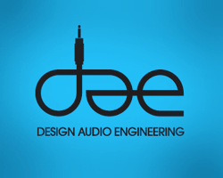
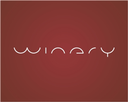
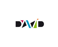
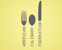


Clever Typographic Logos:

I would say simply playing with letters is not a real creativity, until you arrange them in such a way that they reveal a hidden concept. Therefore, I have collected such typographic logos which deliver a hidden message as well. You just need to study them closely and carefully…best of luck!!


Funky Typographic Logos:

Be it web designing or logo designing, grungy effect is always a treat for eyes. The wooden and rusty look of a logo makes it amazingly catchy. These logos compiled here prove how grasping and appealing they could be.


Corporate Typographic Logos:

In this competitive era, we all strive to have our company on top of others and a logo is the best resource. These typographic logos you view below are the best examples of having a simple but memorable logo for your company. These logos prove how we can make our business look sophisticated and appealing at the same time.


Grungy Typographic Logos:

Be it web designing or logo designing, grungy effect is always a treat for eyes. The wooden and rusty look of a logo makes it amazingly catchy. These logos compiled here prove how grasping and appealing they could be.


Typographic Logos with a face:

Although the concept of creating a face by playing with the letters, is quiet old but at the same time it a frequently used style. These logos here might look childish or cartoonish but one cannot deny the hard work and effort designer has put into them.


Flawless Typographic Logos:

I really enjoyed viewing these logos where the designers have beautifully written the company name without breaking the rhythm between the letters. The flow and connectivity portrayed in these logos show another creative side of typographic logos.


Cropped Typographic Logos:

In these logos you will notice how the letters are being cropped in unique way but still they deliver the company name quiet evidently. The designers have to be very tactful to design a cropped logo without the company name being overlooked.


Symbols and Typographic Logos:

It is a clever idea to merge symbols with fonts while designing a logo. However, designers should be careful enough to see that the used symbols contribute effectively in conveying the message of a business. Here are few typographic logos where symbols are used to deliver the message more clearly and successfully.


Looking at these conceptual logos, don’t you think Typographic Logos are little tricky and demanding to be designed. While designing these logos, graphic designers become more careful as they gotta convey the right message using fewer elements.  Now I would like you all to share your honest perspective….which logos you find more difficult to be designed, typographic logos or the regular logos (text+image)

And of course, if you have more intelligent Typographic Logos to share, you are more than welcome :)


  1. logos On June 9th, 2009 at 10:21 am
    1

    Amazing designs! simple, clean and easy on the eyes.

  1. Roberta Seldon On June 9th, 2009 at 11:26 am
    2

    I love typographic logos! Though they are logo design in its simplest form, yet they are the hardest designs to create.

  1. fadly On June 9th, 2009 at 2:57 pm
    3

    im very-very like this blog… perfect bro…

  1. orphicpixel On June 10th, 2009 at 1:09 am
    4

    this are great logos

  1. Hesham On June 10th, 2009 at 2:20 am
    5

    Great info, thanks for sharing!

  1. hasanah On June 10th, 2009 at 3:53 am
    6

    my personal favourite is david. :) i also like all corporate logos shown here.

    thanks for the compilation!

  1. Thompson Touch On June 10th, 2009 at 9:27 am
    7

    Soda logo and Killed Logo are my two favorites. Stright to the point and highly creative.

  1. Rick On June 10th, 2009 at 3:04 pm
    8

    Good choice.

  1. Avik On June 11th, 2009 at 1:01 am
    9

    Awesome collection.A treat to watch.

    Thanks
    Avik
    Designer
    http://www.brochure-design-india.com/

  1. Kristine On June 11th, 2009 at 6:49 am
    10

    Innovation is definitely key! nice collection.

    I believe all of these logos are innovative but I asked myself would a common eye remember them with ease?

  1. Anna Green On June 11th, 2009 at 11:26 am
    11

    Great selection of logos! I love the killed products logo, it has real movement. The colours are great too. And the difference a slight radial gradient can make! Also something that’s nice that use is an inner shadow.

  1. Rudi On June 12th, 2009 at 12:39 am
    12

    WOW wish i can create those kind of logo
    nice list man, its inspire me

    thx 4 share

  1. Graphic Design Orange County On June 12th, 2009 at 3:12 am
    13

    Yeah! I agree! These are very inspirational! I’m bookmarking this for sure!

  1. fensonism On June 18th, 2009 at 4:31 pm
    14

    I do agree that typographic logos are a little harder to design. There’s a lot of things to be taken into account rather than just juxtaposing images.

  1. Amit On June 19th, 2009 at 8:44 am
    15

    Typically Awesome……… with fresh looks

  1. Mohsin Ahmed On July 17th, 2009 at 12:53 am
    16

    Awesome……. Thanx…..

  1. typography … wednesday? typographic logos « two smiths and a dog On October 7th, 2009 at 10:18 am
    17

    [...] your viewing pleasure and inspiration. Spyre Studios has 40 more, some of which overlap. Lastly, Graphic Design Blog has a great way of categorizing typographic [...]

  1. Teknologeek.com » Teknologeek.com Busca Logo: Concursa y Gana! On October 31st, 2009 at 12:02 pm
    18

    [...] -Les recomiendo que vean los siguientes sitios para que se den una idea de lo que tiene que tener el logo ganador: Negative Space in Logo Design, 25 logos with hidden messages. Logo Design, 30 Most Creative Logos, 8 Categories for Typographic logos, [...]

  1. Typographic Logos VS Graphical Logos - A fiddly comparison!! | Master Design On November 4th, 2009 at 11:08 am
    19

    [...] have played with their logo designs. Enjoy these logos but don’t forget to tell if impressive typographic logos can give the clarity about your enterprise or it is important to have an icon added to the [...]

  1. sticker printing On January 1st, 2010 at 7:14 pm
    20

    like your explanation way …

  1. 8 Categorias de Logotipos Tipograficos | Adventure Graphics On May 6th, 2010 at 4:43 pm
    21

    [...] original: Graphic Design Blog Comparte este [...]

  1. Bumper Sticker On June 3rd, 2010 at 8:42 am
    22

    These categories are really good thanks for share it.

  1. 200+ Text Based Typographic Logos For Your Inspiration | PCandWEB On June 8th, 2010 at 6:09 am
    23

    [...] I personally can visually categorize the above logos in many different categories but i’d like to leave tthat to you as your the ultimate end users and i think you should have the freedom to categories the logos according to your own pattern, but still if you are interested about some interesting categories you can check this. [...]

  1. Tejas Ramakrishnan On July 4th, 2010 at 12:30 pm
    24

    Great collection. Truly awe inspiring.
    Excellent.

  1. logo design chennai On July 10th, 2010 at 3:50 am
    25

    Good work, logos are really nice, thanks for sharing

  1. Koszalin On August 19th, 2011 at 10:56 am
    26

    Really amazing logotypes. Very inspirational to be better in design.


Write for us
  • Top 10 Designers Projects Won
    AbsolutMudd
    217
    ACEdesign
    208
    finaldesign
    198
    neonlite
    192
    vector
    179
    x3mart
    158
    XtremeCreative2
    130
    Sergem
    124
    lakshmiks
    116
    jaggu
    99


Recent Post

Categories

Archives

  • Popular Posts

  •