istanbul evden eve nakliyat
X

Being a Female, What is your Clothing Style?

With every coming year, trends are welcomed in designing fields of fashion, graphics, textile and not to forget, logo designing. Designers’ base their logo designs on these trends taking them to new levels of creativity and craftsmanship. ’09′is expected to bring in lots of variations in design. Many think it will be the year when almost everything will work AND be trendy.

Therefore, with so many expectations and predictions, I thought it will be exciting to list the log designing trends for 2009 released by Logo Orange and Logo Lounge. I would love to hear your thoughts on the predicted trends.
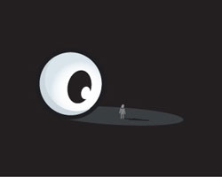
 

1 # Classic Modernism

Since late 2008, classic modernism is adapted once again. It shows some of the logos which convey the company name and message without portraying or saying much. At times it might seem complicated but designers always try it happily.
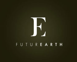
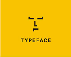
   
the eye Minimalistic First


2 # Typographic Logos

Typographic logos can never fade from the designer’s list of desisning elements as they are too attractive to miss. These logos consistently demonstrate definite message of a company with manners and purity.
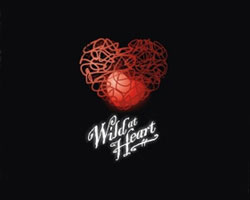
   
FuturEarth


3 # Psychedelic Pop Backgrounds

These logos are believed to be an outcome of a romantic counter culture. Nowadays 1960s psychedelic background patterns are mixed with contemporary shapes to stir mood and emotion in the viewer.

   
Pangur Glass Craft CRA logo 3


4 # Puzzle Patterns

As mostly new designers have no definite designing rules they try using complex vector graphics to intentionally veer away from the rules. These logos might seem appealing but their complexity make you ponder over them for a longer period.
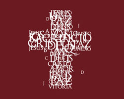
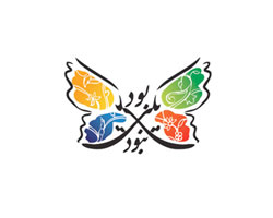
   
Ãklundh Wild at Heart Final


5 # Arabesque

Calligraphy makes the soul of a logo echo, especially Arabic calligraphy. With ample of harmony and connectivity, Arabesque logos are always appreciated. The Arabesque solution is the answer to a designer’s desire for uniqueness.
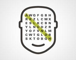
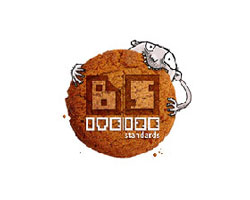
   
Cross Butterfly


6 # Pictograms

Sometimes we need the logos to be designed like a problem solving process. Strong trend is witnessed towards integrating meaningful icons which have the ability to convey the essential values of the brand, its message and its market position.
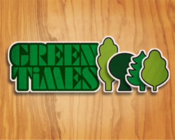
   
One Degree TypeFACE


7 # Tactile

Tactile means relating to touch or invoking the sense of touch and these logos present the material which can be touched. This process is a huge challenge even for the most experienced graphic designers as they have to work with a preferred software which allows them the traditional tasks of cutting, painting and pasting.

   
Bite Size Standards


8 # 80’s Geometry

This trend was introduced in 80’s with the only purpose of capturing viewer’s attention. Monster-like geometrical logos are mostly used by aggressive and self-centered companies to shout in today’s over-saturated market.
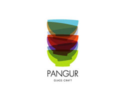
   
Fidelity The Gallery


9 # Origami

Origami-based logos are a good choice for corporate monograms. Origami is the Japanese art of folding paper, but the goal is to use small folds and creases to bring about delicate and intricate objects. For such logos designers have to put in lot of effort and time.

   
Milkystar


10 # Street Art

Street Art brings handmade graphics to mind, with hints of urbanism. When designers want to come up with something original and trendy, they opt for street art which we always find around.

   
Az Smoothe Az Sowebo Arts
 

You must have enjoyed scanning through these predictions but don’t forget that these trends can be a tricky at times. There are many people who think creativity doesn’t follow any particular path and chasing definite trends can make us loose our clients. Jeff Fisher from LogoMotives is one of such p[eople and this is what he says about the yearly predictions.

“When a graphics industry expert proclaims something a current ‘design trend’ it is a ‘breaking news’ message to designers everywhere that the specific ‘trend’ should be avoided from that moment on - rather than followed by a thundering flock of design sheep.”

Designers mantra these days is, “design has no rules” and they try coming up with undisciplined but skilful interplay of type, patterns and images.

I would like to know how many of you think that logo trends should be avoided and why?


  1. David Henderson On March 9th, 2009 at 6:06 am
    1

    Some really beautiful examples of logos here.

  1. Agos Beatle On March 9th, 2009 at 11:07 am
    2

    Hi Charlie!
    I’m Agos Beatle, Translations Coordinator for http://noticias.deviantart.com , a web that publishes news about design in Spanish.
    I wanted to ask you the permission to translate and use the images of this amazing article. Of course, all correspondent credits will be given.
    Hope to hear from you,
    Agos.

  1. Sherice On March 9th, 2009 at 12:16 pm
    3

    Lots of great eye candy here! Thanks for the visual logofest :)

  1. Michael Drahony On March 10th, 2009 at 7:31 am
    4

    Fantastic selection of fun logos!

  1. Geno Prussakov On March 10th, 2009 at 9:16 am
    5

    Excellent post, Charlie. Great categorization, beautiful examples.

  1. Allison Butt On March 10th, 2009 at 9:23 am
    6

    Great article. I love the simple typographic and pictogram logos. In my opinion, I see graphic design (logos, print and web) moving toward a more simple and streamlined style. The arts and craft look is fun, but I think it’s getting a little overused.

  1. Omer On March 10th, 2009 at 12:00 pm
    7

    Great logos. And.. my logo : http://qmerdesign.net/logo.png

    inspired: futurearth

  1. Daniel Campos On March 11th, 2009 at 10:49 am
    8

    Great collection!

  1. nando On March 11th, 2009 at 12:19 pm
    9

    Great post-gave me a lot to think about. I feel that your logo should not only represent you (your business) but also the type of clients or following you want.

    We have to evolve with the times, but also maintain a sense of identity. The greatest logos of all time don’t really follow the tends as much as MAKE them: McDonald’s, Coke, and NANDOISM!

    Keep up the great work!

    Nando

  1. Larry On March 11th, 2009 at 10:14 pm
    10

    A great collection of new logo designs. You can visit http://www.companylogos.ws/ for more on 2009 trends.

  1. Manz On March 13th, 2009 at 4:17 am
    11

    Nice collection.

    I’m partial to the Origami designs - I like those alot!

    No one seems to want to answer your closing question…
    I’ll give it a go…

    First up, I just want to say I believe alot of designers do follow trends, and that these link in with fashion trends which spills over into the music and film industries. All of which are very influencial in this age.

    Secondly, I personally think you should never approach a job with a specific trend in mind - the message should come first with an identity/logo, and the “treatment” (or trend) should be appropriate for that company.

    For example, an Origami style design would be ridiculous for a plastics company!

  1. Charlie B. Johnson On March 13th, 2009 at 7:39 am
    12

    Charlie (Admin) says:

    @ Nando: Thanks Nando for appreciating the post and I really liked your perspective saying that “A logo should not only represent you (your business) but also the type of clients or following you want.” Very true!


    @Manz: Thanks buddy for noticing my closing question whci so many people missed to answer :( but i did not get if you favor the releasing of logo trends or not, as your reply seems to be favoring both aspects.


    @ Omer, Daniel, Geno and Michael Drahony…thnks for appreciating and sharing your favorite trend but you guys missed to answer the closing question :(


    @ Agos Beatle…I allow you to translate my post in Spanish…lets try something different. I am looking forward to it,do send me the link when you have it on your site.


    Thanks to all for the comments but for the upcoming comments i would like you all to answer my question:

    “Do you favor releasing of Logo Designing trends every year ?”

  1. Roberta Seldon On March 13th, 2009 at 7:57 am
    13

    I agree that the classic modernism trend can be somewhat of a challenge for designers. It can be quite difficult trying to convey a company’s message with minimal design elements. Challenging yes, but also fun!!

  1. Manz On March 13th, 2009 at 4:41 pm
    14

    Hi Charlie,
    I thought I was clear in answering your question “do you think that logo trends should be avoided and why?” I WOULD NEVER SUGGEST YOU FOLLOW A TREND. My plastics example was used to show why.

    You seem to put forward a new question… “Do you favor releasing of Logo Designing trends every year ?” What do you mean? Do you mean, Should there be lists like yours released?
    There’s no harm in my mind if designers can recognise ‘relevance’ should come first. These kinds of lists can be inspiring, but that’s all… to me.

  1. Rodrigo Barragan On March 19th, 2009 at 6:08 pm
    15

    Smart comments, beautiful examples.
    Hi from Mexico!

  1. Nate At Plasticprinters On March 27th, 2009 at 9:54 am
    16

    Wow, very cool! Lots of great and impressive inspiration. I think my favorite one was the Future Earth logo. It’s not snazzy or anything but solid and impressive.
    Great List!

  1. Yusuf Guleryuz On March 28th, 2009 at 9:03 am
    17

    amazing and inspires me thanks

  1. Jeff Fisher LogoMotives On March 28th, 2009 at 7:20 pm
    18

    Just came across your mention of my quote in your article. I was on holiday when it was posted. Thanks!

  1. Lindsey On March 28th, 2009 at 9:03 pm
    19

    I think the Milky Star one is brilliant!

  1. Chen On March 31st, 2009 at 2:07 am
    20

    nice, but lacks sorting

  1. Designers Resume On April 1st, 2009 at 1:00 am
    21

    Wonderful Logos! I was inspired in Classic Modernism vision in man says beautifully and unique milky star.

  1. Jimmy Howard On April 8th, 2009 at 3:37 am
    22

    DO NOT FOLLOW TRENDS, you will end up exactly like them, well that is my take, i like the part where i get to design a logo and then do some research on trends but at the end my logo looks like nothing that i have seen in my research. I use trends as eye candy to broaden my creativity in coming up with a logo, but the finished product never has any relevance to my eye candy. So, you can’t avoid logo trends, but just use them as research to come up with the next best or worst logo depending on what your client wants, what business it is and how you want your audience to relate to it. Cheers.

  1. jeprie On May 22nd, 2009 at 2:22 am
    23

    Very nice logo. I really love the origame type.

  1. Mr Corporate Graphics On August 4th, 2009 at 1:09 pm
    24

    Absolutle love the Future Earth logo!

    I think the key thing with all of the 2009 logos is to still ensure they could be printed b&w and keep their form - some of the examples i feel are too detailed to keep their identity when viewed from a distance or in a “two colour” format.

  1. Caity |ZA Cartridges On September 10th, 2009 at 3:50 am
    25

    Just stumbled across here, and just love this site, so different, informative and good content.

    I too just love the Future Earth logo, its great to see that people are still using logo’s in their stuff

  1. A u d e e On September 20th, 2009 at 7:25 pm
    26

    Love this post, since you came with brief explanations Charlie!
    Usually my logo designs are just using geometry shapes. It is interesting how “Origami” logo style has been becoming a trend. It redraws complex object with simplicity and you still play with a bit of geometrical shapes too! Definitely I should try to use the style for any of my upcoming logo projects :D.
    Thank you for sorting this out!

  1. abexalochuche On October 3rd, 2009 at 1:51 pm
    27

    Mellifluous blog. I not in the least be sure what I am flourishing to come across next. I over you should do more posting as you have some bonny aware stuff to say.

    I’ll be watching you .

  1. Branding / O poder da imagem « Desafio 10 Milhões - Making Of On October 16th, 2009 at 6:07 am
    28

    [...] A Showcase of 2009 Logo Trends [...]

  1. nathan Simpson On October 28th, 2009 at 12:48 pm
    29

    While the examples are nice graphics - I wouldn’t go as far to say they are nice logos….

    When you loose -
    1. the ones with gradients
    2. that are unscalable
    3. that won’t work black and white

    well then you are left with maybe one or two logos from the examples that might actually work -

    I’d like to see some trends that apply to real logos…

    thanks

  1. Nadine On October 30th, 2009 at 11:15 pm
    30

    Excellent post. Thank you for sharing!

  1. nathan simpson On November 1st, 2009 at 3:10 pm
    31

    no matter what you do in you logo design - please remember the golden rules - scaleability, legibility, and work well in black and white without gradients - I’m afraid the many of the examples provided fail to meet the most basic logo design rules - some rules are made to be broken but not these - thx…

  1. Motef Design On January 1st, 2010 at 9:57 pm
    32

    I got to agree with the last post, some of these logos are very nice, but in simplicity is virtue, most of these look more like artwork.

  1. Rocky Fisher On January 3rd, 2010 at 7:04 pm
    33

    I love your site but you really could do with a proof reader or editor to look over your work. I saw many mistakes, the most ghastly being mistaking “loose” for “lose” at the end. *Shudder* Please, read over your work. It will make you vastly more professional and will lend more weight to your other talents.

  1. Charlie B. Johnson On January 3rd, 2010 at 11:45 pm
    34

    Hi Rocky…thanks for stopping by on my blog and I am really embarrassed for these content mistakes you found :( Actually you are right, most of the times I add the post in such a hurry that I don’t proof read it. I will be surely careful next time and if you ping me for any mistake you come across, I will really appreciate. Thanks

  1. ferzam On March 31st, 2010 at 8:09 pm
    35

    nice logo designs here - very inspiring. logo designs, for me, is a bloody project when it comes to dealing with a client who “knows” designs… but as they say, customers are always right…so there…

  1. Dugu On April 29th, 2010 at 4:01 am
    36

    wow, really amazing stuff, i’m self taught so i have a long way to go but these examples are hella insightful and inspiring

  1. Watching Trends in Graphic Design | Logo History On July 11th, 2010 at 2:47 am
    37

    [...] Graphic Design Blog: An Exciting Showcase of 2009 Logo TrendsAbuzeedo: Design Trends for 2009Smashing Apps: 11 great Resources and Inspirations of Current Design [...]

  1. Dustin On January 21st, 2011 at 6:45 pm
    38

    Excellent, nice references!

  1. Michelle On October 4th, 2011 at 9:45 pm
    39

    Great examples!
    Thanks for sharing :)

  1. Connie On December 7th, 2013 at 5:39 pm
    40

    I just do what I like to do. I paint and design and if I like it, I simply like it. I see, after walking away from my project and coming back to it, that I can make improvements though it may look great the way it is. I always wear what looks good on me, in my mind, and that is all that matters is what is what I like. I’m not going to cut my hair to follow the trend of haircuts. I was probably the only girl that got a tattoo, besides my friend when we were about 20 years of age. I did not know of any girl having a tattoo, but now it is a different story. I wonder my girlfriend and I started that trend. Didn’t mean to. Just wanted a tattoo. When I am asked to create something for a client, collaboration is a must. I have to create what they like and help them make the best choices by supplying them with different options, views, images, layouts, etc. that correlates with what they have in mind, the message they are wanting to convey. I never followed a trend. I like what I like and that is it. I do not do or create because others are doing it. I am my own unique person and I follow my own heart. I believe this to be true with everyone. This is probably why they say, “different strokes for different folks.” I work with others because they have such wonderful ideas and this sparks my ideas, my imagination. They have their own uniqueness, imaginations. Trends may be good for some things, but I think we should be our individual self. Why should there be rules in art? I know that some colors, in my eye, do not look good together and the same is true for fonts. But, if they look good together and the rules say not to use them, then I disagree with the rules for that particular project. An art teacher told me once to never paint an even number of birds in the sky because it wouldn’t look right. I proved that to be not true. This could be the reason I disagree with some of the rules. Anyway, if it works, forget the rules. If I was in a building with other people and we had to obey the rules or pay the consequences and the top rule was to stay in our seats NO MATTER WHAT, I would definitely break the rules especially if I smelled or saw smoke. I’m leaving, see ya’ll later. :) Thank you for allowing me to post my opinions. We are all entitled to them whether they are wrong or right. :)


Write for us
  • Top 10 Designers Projects Won
    AbsolutMudd
    217
    ACEdesign
    208
    finaldesign
    198
    neonlite
    192
    vector
    179
    x3mart
    158
    XtremeCreative2
    130
    Sergem
    124
    lakshmiks
    116
    jaggu
    99


Recent Post

Categories

Archives

  • Popular Posts

  •