istanbul evden eve nakliyat
X

Being a Female, What is your Clothing Style?

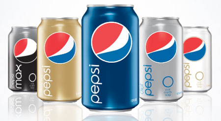
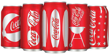
          The moment I saw the coke cans, I was in love with them. Pepsi cans deliver a sophisticated appeal but stilll don’t look as good as the Coca-Cola cans.

Which of these cans make you crave for the drink - Pepsi or Coca-Cola?


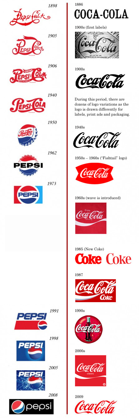
          Two weeks back, while digging some creative posts on Digg.com, I saw this JPG with almost 6500 diggs. Well, my curiosity was answered with a wrong demo chart which showcased the transformation of Pepsi and Coca-Cola logos ever since they came into existence.

The comparison diagram shows the logo evolution of these top soft drink brands from late nineteenth century to the current face of the 2000s. However, it seems as if only Pepsi Logo has evolved in all these years as the image witnesses the existence of script style Coca Cola Logo since 1985. Isn’t it really stupid to claim today’s Coca-Cola logo to be same since 1885 when such advance tools did not exist only?

 
Although Coca-Cola has been adding very subtle and minute changes to its logo design over the years but can’t be ignored in any way. Just check the blunder in the below given chart displaying the evolution of these top logos
 
 
Anyhow, last week a well-known logo design blog took the responsibility of coming up with correct research.
 
First appearance of Coca-Cola Logo: The above mentioned post reveals that Coca Cola’s logo first of all appeared in the Atlanta Journal Constitution in 1886 as both a slab serif and chunky sans serif and then in mid-1887, Frank Robinson, Coca-Cola’s bookkeeper, drew the first traces of the Spenserian script logo, which we all recognize so well.
 
First appearance of Pepsi Logo: As we all see, over the years the Pepsi logo has changed dramatically from typographic logo into a sophisticated symbol. With the Pepsi “crown” appearing in the 1940s along with the addition of the colors blue and white to commemorate the war efforts of the U.S. In the 60’s the type changed from a script font to the now familiar bold sans serif.

Let’s have a look at the new and correct version of these world famous logos evolutions.


Now, when I am done with the showcasing of these famous logos evolution, something is bugging my mind which I would like to share with you all. If you notice Pepsi has been undergoing drastic changes in all these times while Coca-Cola logo has been ruling soft drink industry with its minimal redesigning.
 
Do you think it is important for every brand to keep on getting major redesigns for their logos to achieve stable success and corporate identity?
 
Before you give your answers, I would like you to consider this chart where Coca-Cola branding has been consistent over the years (trying to create history) while Pepsi has been releasing drastic changes under the "Choice of a New Generation" philosophy (which justifies radical change and periodic reinvention).
 
Despite your reply, I would like to add my opinion here…the present Pepsi Logo is a real disaster while the flawless beauty of Coca-Cola has not lost its place in so many years. The latest version of Pepsi Logo appears to be a distorted image of a smiling fat man. I would also like to add here: “Everything that coca-cola succeeded in its history, Pepsi failed.” Therefore, if logo redesigns can be so ridiculous then its better companies leave their logos unchanged…do you agree?


  1. Mark On August 10th, 2009 at 9:38 am
    1

    I have always fought with the debate if drastic branding changes are good or if a company should stay with the their very recognizable brand. I recently changed my brand/logo but with me being a small fairly new company (5 years) I have yet to esablish a look that is immediately recognized across the worl. Also I kept the basic elements of my brand.
    I think that a company would do better slightly changing their branding if they change it at all. Some brands do need slight tweeking and because of name changes a brand will need some updating but for the most part keep what works.

  1. Luis Lopez On August 10th, 2009 at 11:03 am
    2

    Excellent article, I had the same impression that you when I see the other post, but honestly I didn’t do the research to see if it was really true but thanks for opening pour eyes!!

  1. A u d e e On August 11th, 2009 at 2:32 am
    3

    I have to say that Coca-Cola is a true example of how a brand should be consistent to persist their corporate identity. The 1973 Pepsi logo could be the best among any redesigned versions IMHO. Simple yet it is endurance. If Pepsi keeps it with consistency or having minor redesigns from time to time, it would possibly going to be an interesting Cola war ever happened on planet earth :P

    So, I don’t believe that major redesigns of logos is the only one solution to achieve stable success and corporate identity. Because Coca-Cola is the true example of how a persistent logo could be deliver with creativity to look fresher without the needs of major redesign.

  1. jeanneleez On August 11th, 2009 at 3:24 am
    4

    The new Pepsi logo could just as easily be selling sneakers as a beverage. The packaging is really bland. This isn’t saying that Coca-Cola’s stodgy, old-fashioned lettering is any better I’ve always wanted to clean that up. What works and is brilliant is that Coca-Cola manages to funk it up in the new packaging. They took something old and made it new again. Well done. :-)

  1. Tracey @ brochure printers On August 11th, 2009 at 4:14 am
    5

    To me, a logo that always changes is unsettling and shows the company is inconsistent with its ideas, which could be a bad thing. Where as something that remains majorly unchanged for a long time, stays in your head and is more trusted.

  1. Emily Reed On August 11th, 2009 at 5:32 am
    6

    This post is so interesting. Love it!

  1. Daniel Campos On August 11th, 2009 at 7:36 am
    7

    Actually this article is ORIGINAL from BrandNew.
    Please, put on yours articles the links ORIGINALS of images ande themes. This is cool with the net.

    http://www.underconsideration.com/brandnew/archives/coca-cola_vs_pepsi_revised_edition.php

  1. JP On August 11th, 2009 at 7:54 am
    8

    Is the author of this blog post the same person who wrote the following? :
    http://underconsideration.com/brandnew/archives/coca-cola_vs_pepsi_revised_edition.php

  1. Iva On August 11th, 2009 at 10:27 am
    9

    Thanks for saving our side! :D I’ll have a Max for this post.

  1. Anna Green On August 11th, 2009 at 11:20 am
    10

    I don’t think drastic redesigns are ever necessary for these two brands… In fact i think that pepsi should bring back their 1906 design… Way better than what they have now… And as for coca cola its a timeless classic that should never be changed, i think that they could do with bringing back their 1900′s swish though that was much nicer!

  1. Thomas On August 11th, 2009 at 11:26 am
    11

    Great Post ! I love the last Pepsi font

  1. Nathan Pope On August 11th, 2009 at 4:59 pm
    12

    I have always liked the Pepsi logo more than that of Coke. Having the changes of the two current logos compared side by side over the years however, I definitely get the feeling that Pepsi hasn’t really had one idea of what their company image should be. Coca cola has maintained a similar image throughout all these years. I like that Pepsi is willing to embrace changes and grow/evolve as a company.

  1. Charlie B. Johnson On August 11th, 2009 at 11:30 pm
    13

    @ Daniel Campos and JP…Reading your comment saying that this post have been taken from "Brand New" I will like to clarify that I have picked these demo chart from "Brand New" but friend I did not forget to give them the credit. From the moment, this post was published, the images were linked to the orignal post. Apart this, I have linked the orignal post in the 3rd paragraph on the word "logo design blog"(just below the fail image)


    Referring to the wrong chart of this logo evolution, I have clearly quoted in my post:


    "Anyhow, last week a well-known logo design blog took the responsibility of coming up with correct research."


    In my opinion I have given complete credit to the orignal article and as far as the content of the post, you must have observed I have shared new information e.g The Summer Cans of both the drinks.

  1. JP On August 12th, 2009 at 7:37 am
    14

    Thanks for clarifying. I wasn’t sure if the author was the same in the two cases. It might make it easier, if you explicitly mentioned the source article (at the bottom of the blog post, for eg.), in addition to linking the images.

  1. STRAIGHTALK On August 12th, 2009 at 9:46 pm
    15

    Asolutely, Making changes is NOT always a good thing.. Trust Me!

    Norman Flecha
    STRAIGHTALK

  1. Charlie B. Johnson On August 12th, 2009 at 11:49 pm
    16

    @ Mark…I hope you recieve good response after rebraning but I will still advice that once you have achieved and identity, avoid changing it efter every short period.

    @ Tracey…I completly agree with you on the point that frequent changing of your logo is truly harmful for a brand as it signifies unstability of a brand.

    @ Anna Green…You are also among thousands of those Pepsi fans who want them to resuse their old logo, which I think was amazing and redesigning has turned out to be a big mistake on their end.

    @ jeanneleez….I really enjoyed reading your perspective over the redesigning of these world famous drinks especially Coca-Cola but still I think they did a great job.

    @ Thomas, Emily Reed, STRAIGHTALK…thanks for enjoying the post and sharing your views about redesigning of logos.

  1. www.andrewkeir.com On August 13th, 2009 at 3:56 am
    17

    Coke for sure, I’m not a fan of the new Pepsi look at all.

  1. Daniel Campos On August 13th, 2009 at 7:50 am
    18

    @Charlie B. Johnson
    Mr. Johnson, I think that any article from any blog/site when cite other blog/site (and namely use the informations from there) MUST to say the NAME of blog and not “a well-known logo design blog”. Anyway, I’m sorry for that ok. I apologize for it.

    COngratz for the blog
    All the best
    Daniel

    PS: by the way, the new cans to summer from Coca-Cola isn’t new news.http://www.thedieline.com/blog/2009/05/cocacola-summer-cans.html

  1. John Rushing On August 16th, 2009 at 9:25 pm
    19

    I agree with all of the comments about brand consistency as it relates to consumer trust. Pepsi seems to be successfully marketing itself as a kind of perpetual fad, always new, always exciting. One becomes so accustomed to the branding changes that the next one becomes anxiously anticipated…a bit like releasing updated car models every year to keep them selling.

    But Coca-Cola’s tactic, in my mind, is more compelling and ultimately more effective. Instead of changing their image entirely, they re-adapt the same basic logo into changing contexts. The new can designs are a graphical collage of historical Americana, which Coca-Cola uses to reinforce their place as an inextricable part of American history and culture. Just as Pepsi will always be (or at least make themselves out to be) cutting-edge, Coke will always exist as the indelible classic, not a fad, but an unshakable cultural institution inseparable from the history of the country itself.

  1. BlindAcreMedia On August 25th, 2009 at 12:16 pm
    20

    I’m not a big soda drinker so I have an un-bias look on both of their logos. It’s nice to see the time line. I never realized how much pepsi changed and how subtle the coca cola changes are.

  1. Cookie Creative - Graphic Design Manchester On August 26th, 2009 at 1:07 pm
    21

    Excellent article, thanks

  1. Robbie Forrest On August 27th, 2009 at 4:54 am
    22

    I can see where you’re coming from in respect to how the changing of logos can to many other companies make the message to consumers unstable however I don’t believe this is the case for Pepsi. I am personally a fan of Pepsi, and although I favor the 1962 logo, i don’t believe that by changing their design ‘drastically’ has actually had much of a negative effect. Coca Cola is Coca Cola, they may have refined their one design for over a century and everyone knows that logo but thats their choice. Its like saying to someone they should wear the same clothes every day so that people can recognize them, just because Pepsi went shopping doesn’t make it a bad thing.
    The marketing of Coca-Cola is so wide spread that you would struggle to find a region without some sort of poster, billboard or crushed can that didn’t have that logo in your face, all credit to their designers and marketing team. However, any change to the design would disrupt the companies image, the same thing hardly effects Pepsi. They are two different companies with two different images.

  1. cynthia victor On August 28th, 2009 at 12:38 am
    23

    i like the blog and i like the new Pepsi logo

  1. arenacreative.com On August 28th, 2009 at 11:15 pm
    24

    There was definitely some shock factor with the new pepsi logo, it took a while but it’s starting to grow on me.

  1. sonnydesign On August 30th, 2009 at 1:26 am
    25

    For me Coca cola logo is the best compared to pepsi cola logo. Coca cola is very simple yet brandable

  1. JAYGRFX On August 31st, 2009 at 9:38 pm
    26

    I’m conflicted on the question about rebranding… On one hand, the company has a recognizable logo which consumers identify with. Changing it can be disasterous. On the other hand, if they don’t change the logo, they run the risk of becoming stale and old fashioned. Consumer packaging changes frequently because we have short attention spans, and if your product doesn’t have a modern look, it can affect sales.

  1. Darren On September 1st, 2009 at 3:51 am
    27

    I really love the ’73 Pepsi logo for some reason. If my brand had as many logos as them I’d think I go back and re-use some. I would however not bring back the cursive Pepsi Cola script logos.. that’s too Coke-ish.

    I think since that Coca-Cola brands it self with the words “CLASSIC” a major logo change would prove to be a big fail.

  1. Speicherkarten On October 10th, 2009 at 5:22 am
    28

    This is a great article, I also seen this floating around, I think what the original author of that JPG was trying to show was just the type in general has pretty much stayed the same, they have made changes but none as drastic as Pepsi.

  1. Miguel A. Alarcon On February 12th, 2010 at 11:08 pm
    29

    Well I am not so glad all the changes with the Pepsi logo, but I check on the internet of some Pepsi retro commercials the first of appeaering Pepsi of the 1940′s is the Pepsi Cops well the 1940′s and 50′s logo seems very unique but the 1973-1991 logo is a secon favorite even thugh I grew up with that logo. and offcourse I have never seen any Pepsi ads with Pepsiman well that is an ad they have in Japan.

    What I don’t like about this Pepsi logo that we have now is that people say it looks like the Obama logo so make it more hip and more like the Pepsi that tasted for real the Throwback has the taste of what the Pepsi Cola is the true drink that is for you.

    What I really suggest for Pepsi is to change their logo again more recodnisable than the company that makes the Mustang car that it even has the famus swired bottle, with the unique Pepsi-Cola taste I think it is a time to look at a twist to compare the next Pepsi logo to be similar to the Ford logo well Pepsiman should drive a Mustang that the company that makes that car have a similar design with the next Pepsi logo so this makes Pepsi and Ford Mustang have something in common with the logo.

    Miguel

    Pepsi throwback is actually the real Pepsi-Cola taste that every one loves.

  1. James On February 18th, 2010 at 6:00 am
    30

    Great article.
    Successful brand identifyers are uncomplicated, striking and instantly recognisable.
    As far as the cola wars go, Pepsi are number two everywhere except in the Asian Sub-Continent and Middle East. Perhaps this is a key reason why a constant drive to re-invent their brand image has prevailed. One can draw a parallel with McDonalds and Burger King here. Burger King ‘modernised’ its corporate identity in the late ’90s with the new logo arguably far less recognisable/iconic than the well known ‘block sandwich’ design introduced in the ’70s.
    When one reflects further in this regard, isn’t it interesting note how in recent years ‘retro’ branding has become very popular. We see airlines painting aircraft in retro liveries, sports teams reverting back to ’80s style designs (esp in the NBA for example). It’s almost as if organisations have realised that corporate branding in some cases has over-evolved and become excessively complex. Look at American Airlines for example - a timeless brand identity which hasn’t dated and remained constant for over 40 years; then compare this with United, their number one competitor who have changed their corporate identity three times in the last 20 years. Pepsi actually got their brand right in 1973 and this identity should never have changed.

  1. Evolution of the soda pop giants « Taylor:Design On March 8th, 2010 at 12:11 am
    31
  1. Joe On May 8th, 2010 at 9:36 am
    32

    I just watched a 60s movie and saw the Coke logo… still the same… free advertising for them… it should never change… plus it’s the best looking logo ever

  1. Eddie On October 6th, 2010 at 6:48 pm
    33

    I love this post. I completely agree with your assessment that companies shouldn’t undergo drastic logo changes. Coca-cola is timeless. Bottom line. It represents so many things about America and American history. Whenever I hear some old man talking about sitting at a baseball game when he was a child, he remembers drinking a Coke out of a glass bottle with his ballpark frank. I hear stories like this all the time. Not once have I heard a story concerning Pepsi in this respect. This could just be me. Coke has consistency in design throughout their company, not just with the cans and bottles. Advertisements, merchandise, and so on. This creates a unity and sophistication that is unrivaled in the industry. I personally am comfortable with Coca-cola and don’t feel like they’ve ever let me down.

  1. Brad On March 23rd, 2011 at 6:24 pm
    34

    What I think is the funniest about the two is Pepsi started out red and now it’s Black and Coke went from black and now is red…

  1. majid On March 17th, 2012 at 3:08 am
    35

    hi
    thanx for your good post . I definitely agree , the new pepsi logo has no equilibrium and my eyes don’t like it .
    i think it was much better in 60′s 70′s and 80′s . i guess this pepsi logo is not such a excellent logo for this huge company .

  1. C'Raisin On March 23rd, 2013 at 10:18 pm
    36

    The Coke and Pepsi logos are ugly, and were ugly. The Pepsi cans make me crave for the drink more though, even though the new logo is REALLY fucking ugly and looks like an annoying modern logo for shoes or some shit, the red color on the Coke cans looks disgusting. The Pepsi logos from 1906, 1940, 1962, 1991, 1998, and 2005 look good, the 1900s, 1940s, 1960s, 1987, 1990s, 2000s, and 2009 Coke logos are good. Changing a logo isn’t always a bad thing, people just love nostalgia and remembering the fact they used to be a small business and started a long time ago. The whole “staying the same old timey small business family company” thing is just another advertising gimmick (Coca-Cola doesn’t do it though, maybe because people do it themselves), all businesses started small, yours isn’t better because you brag about it.


Write for us
  • Top 10 Designers Projects Won
    AbsolutMudd
    217
    ACEdesign
    208
    finaldesign
    198
    neonlite
    192
    vector
    179
    x3mart
    158
    XtremeCreative2
    130
    Sergem
    124
    lakshmiks
    116
    jaggu
    99


  • Twitter

    14397
    Follow @graphixdesign
  • Facebook

  • Subscribers

    4,000


Recent Post

Categories

Archives

  • Popular Posts

  •