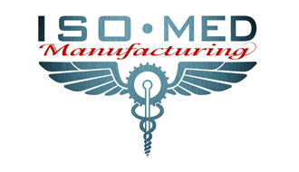
ISO-MED
Submitted on: 09 Oct 12
Website Address: http://lineuarts.blogspot.com/
Category: Health Care Logos,Medical Logos
Logo Rating:
Logo Description:
By LINEU ZADERESKI
ISO-MED’s original idea of a logo was to somehow implement a medical image with a machining image; Lineu helped us complete this feat. The base of the logo is similar to the Common Medical symbol called a Caduceus. While looking at the Caduceus as a base, we wanted to change the image to look a bit more machine shop orientated. So at the top of the staff Lineu designed a gear to connect to the outside wings. We also removed the snakes and replaced them with “rings�? leading into the end of a screw. In the end, Lineu designed an image which joined the Medical Field with the Manufacturing field in perfect harmony.


 (4.75 out of 5)
Got something constructive to say?