istanbul evden eve nakliyat
X

Being a Female, What is your Clothing Style?

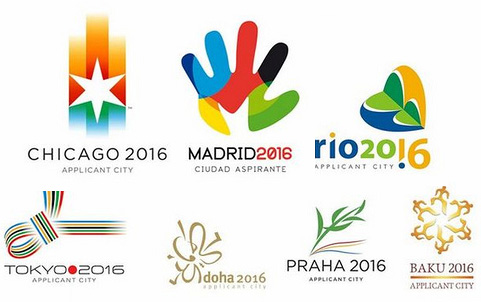
Two weeks back I came up with a post showcasing logos of all the capable cities bidding for 2016 Olympics “2016 Summer Olympic Logos – May the best logo win!!”. However, this Friday decision was taken and Rio de Janeiro was opted as the host city for 2016 Olympics among strong contestants like Madrid and Chicago. With this announcement, Rio de Janeiro has won the title of being the first South American city to host the Olympic Games. Well, this time, the treat is double for Brazil globally…It will host the 2014 World Cup and 2016 Olympics, two of the greatest events in the world of sport.

The Brazilian president Luis Inacio “Lula” da Silva, said some historical words while making a vain attempt of stopping his tears:
 

"It’s a dream that we are dreaming for several years," the president said. "We worked hard to make it to this point and it’s the greatest sensation ever to see the success of the project Rio 2016, if I die tomorrow, I’ll certainly die satisfied."


The selection of Rio over strong contenders like Chicago and Madrid, was not an easy task for the International Olympic Committee (IOC). US President Barack Obama had flown to Denmark on Friday morning to join his wife, Michelle and for the first time a current US president addressed the IOC in an attempt to win the Games. However, Chicago’s early elimination with only 18 of the 94 votes in the first round poll of IOC delegates, was quiet surprising. The second city to be eliminated of the polling was Tokyo with 20 votes, leaving the competition between Madrid and Rio de Janeiro. The final ballot saw Rio win by a comprehensive margin of 66 votes to 32.
 

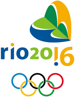
Logo of the host city of Olympics 2016:

 
Ever since, Rio was among the list of shortlisted cities of 2016 Summer Olympics, critiques have appreciated this simple but impressive symbol. The logo was revealed in 2007, during the Brazil’s Olympic Award ceremony chose the Sugarloaf Mountain (PortuguesePão de Açucar), a prominent heart shaped landmark of the city, as their symbol.

Sharing my views over the "Rio Logo" I would agree that applied colors brilliantly combine the beauty of Rio with Olympics thrill.

With a heart shaped logo, they have succeeded in delivering the international feel of Olympics.
 
Your Turn to Talk:
After providing all the facts and features of 2016 Olympics, I want to give you all a chance to share your views over this international verdict. Do you think right decision has been taken or any other contestant city was a better choice than Rio? Don’t miss to analyze the logo closely and comment to tell if it is good enough to be remembered as “winning logo for 2016 Olympics.


  1. Shane Walgama On October 5th, 2009 at 11:06 pm
    1

    Love the Rio 2016 Logo…Brilliant branding…

  1. Shane Walgama On October 5th, 2009 at 11:08 pm
    2

    tokyo is quite interesting too

  1. Chrisjazzingup On October 6th, 2009 at 2:55 am
    3

    This is a good logo, but the colours are more impressive for me than the forms.

    If I remember right, all candidate city who win the olympics change their logos after a few years. Really hope they won’t choose the London 2012 way…

    before
    http://www.bbc.co.uk/radio2/shows/vine/media/london2012.jpg

    after
    http://www.frederiksamuel.com/blog/images/london2012.jpg

  1. Esquire On October 6th, 2009 at 11:10 am
    4

    I think that they fought a good fight, and deserve our support now that they have won. I would have loved for the games to be held in Chicago, but alas….

    http://procrastinationmaterial.blogspot.com/

  1. Nate On October 6th, 2009 at 1:06 pm
    5

    Everything about the Rio 2016 logo strongly reflects the nature of the city (maybe more of a city logo than an Olympic logo). Although I think it could be stronger without the symbol. The text itself holds a lot of information.

  1. Employment Attorney On October 6th, 2009 at 5:35 pm
    6

    That’s too bad. I was hoping for Chicago but congrats Rio de Janeiro

  1. Girlie | Digital Room On October 7th, 2009 at 3:06 am
    7

    The logo looks great! However, I think it can still stand out even without the symbol. But, overall the logo’s very reflective of the city of Rio de Janeiro.

  1. bus On October 7th, 2009 at 4:33 am
    8

    Its bad for Chicago…

  1. elisa On October 7th, 2009 at 2:44 pm
    9

    I didn’t think the Rio logo was the best, I liked the Chicago and Madrid logos better, as they were more vivid, but congrats on the win Rio!

  1. Carson Shold On October 7th, 2009 at 7:29 pm
    10

    Unfortunately I haven’t been to Rio, yet, but it’s supposed to be one of the best places to go party, so everyone is going to have an absolute blast!

    Cheers

  1. STRAIGHTALK On October 8th, 2009 at 1:07 pm
    11

    I personally liked the CHICAGO 2016 logo best.. sorry folks!

    and Thank You for Joining Me at My network http://www.151years.com

  1. r4 games On October 9th, 2009 at 3:30 am
    12

    Thanx for the information. at least it was better then chicago…….I mean you don’t want to have games in that cold place……

  1. reisezubehor On October 9th, 2009 at 4:44 am
    13

    It says South America not Latin America. Then again judging by your ignorance you would think Mexico is in South America. Furthermore, nice spit on the ugly faces of the House Nigger Obama and his equally ugly, and rapidly getting fat, wife. The Atlanta Olympics was so pathetic and badly organized. Olympic should never again be in the US.

  1. Jason On October 12th, 2009 at 1:57 am
    14

    Thanks for information i think Rio really deserve it . And Madrid have best logo after that Rio other are not very impressive .

  1. handy zubehor On October 14th, 2009 at 6:37 am
    15

    I like Chicago and Madrid….If I had to vote, I guess I’d choose the Madrid logo.

  1. nintendo ds r4 card On November 5th, 2009 at 2:31 am
    16

    Wow looking pretty cool man!I think the logo will make and impact. I find it better than the Chicago logo.Thanks for sharing this info.

  1. r4 On November 5th, 2009 at 6:52 am
    17

    I like the rio logo very much. Especially its color combination is great. Rio in real sense deserve this and as they have got the right to host this event in 2016 my best wishes are with them.

  1. Fred Varao On February 28th, 2010 at 12:53 am
    18

    The logo is just fine! Our first time!We don’t care about “The best things” We just wanna heve fun! We have a lot social problems, but we going to fix it!We grow up wating American Cartoons and movies! Americans are the best! we love Americans!
    Americans are very welcome in Brazil!
    Thanks for the support!


Write for us
  • Top 10 Designers Projects Won
    AbsolutMudd
    217
    ACEdesign
    208
    finaldesign
    198
    neonlite
    192
    vector
    179
    x3mart
    158
    XtremeCreative2
    130
    Sergem
    124
    lakshmiks
    116
    jaggu
    99


  • Twitter

    14433
    Follow @graphixdesign
  • Facebook

  • Subscribers

    4,000


Recent Post

Categories

Archives

  • Popular Posts

  •